Do Not Design for Singapore Shorts— Celebrating the best and upcoming talents in local short films
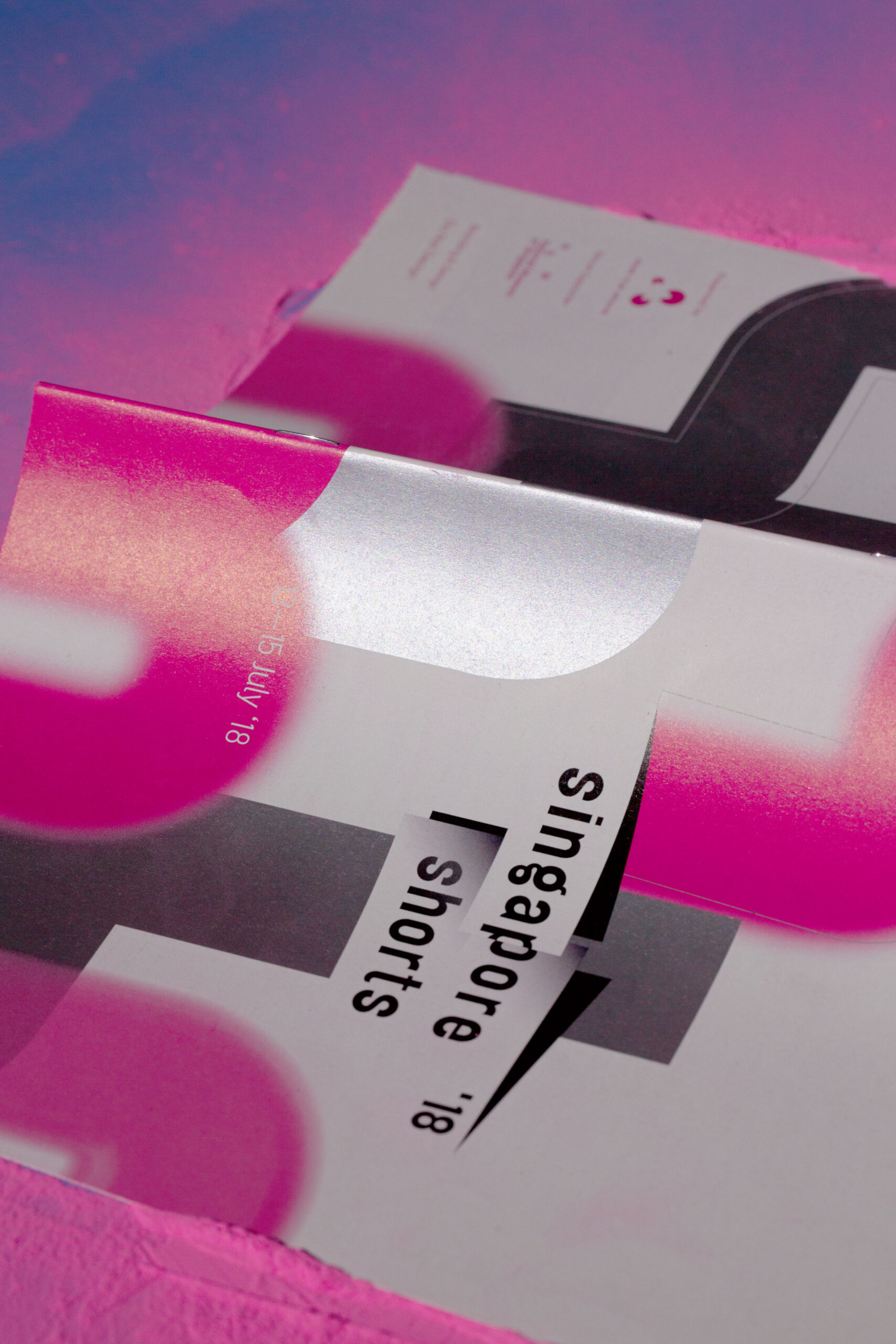
Singapore Shorts
Services
Creative Direction
Design Direction
Creative direction
Yanda
Design & Art direction
Yanda / Preston Tham
Printing
Dominie Press
A project by Do Not Design
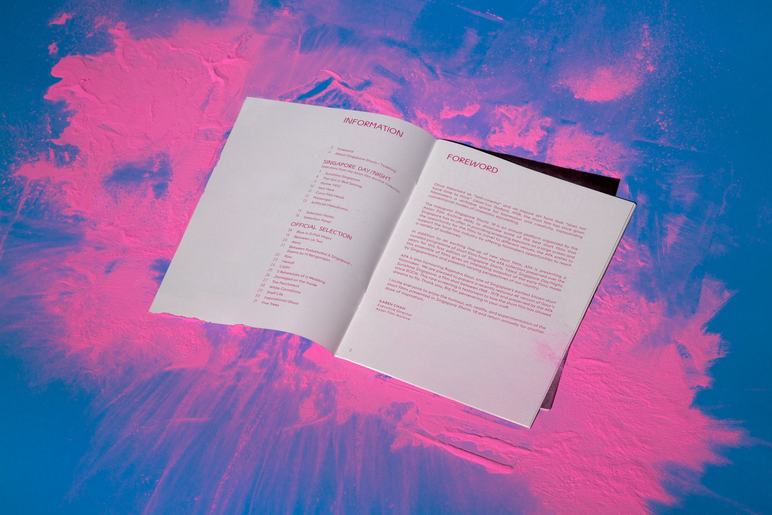
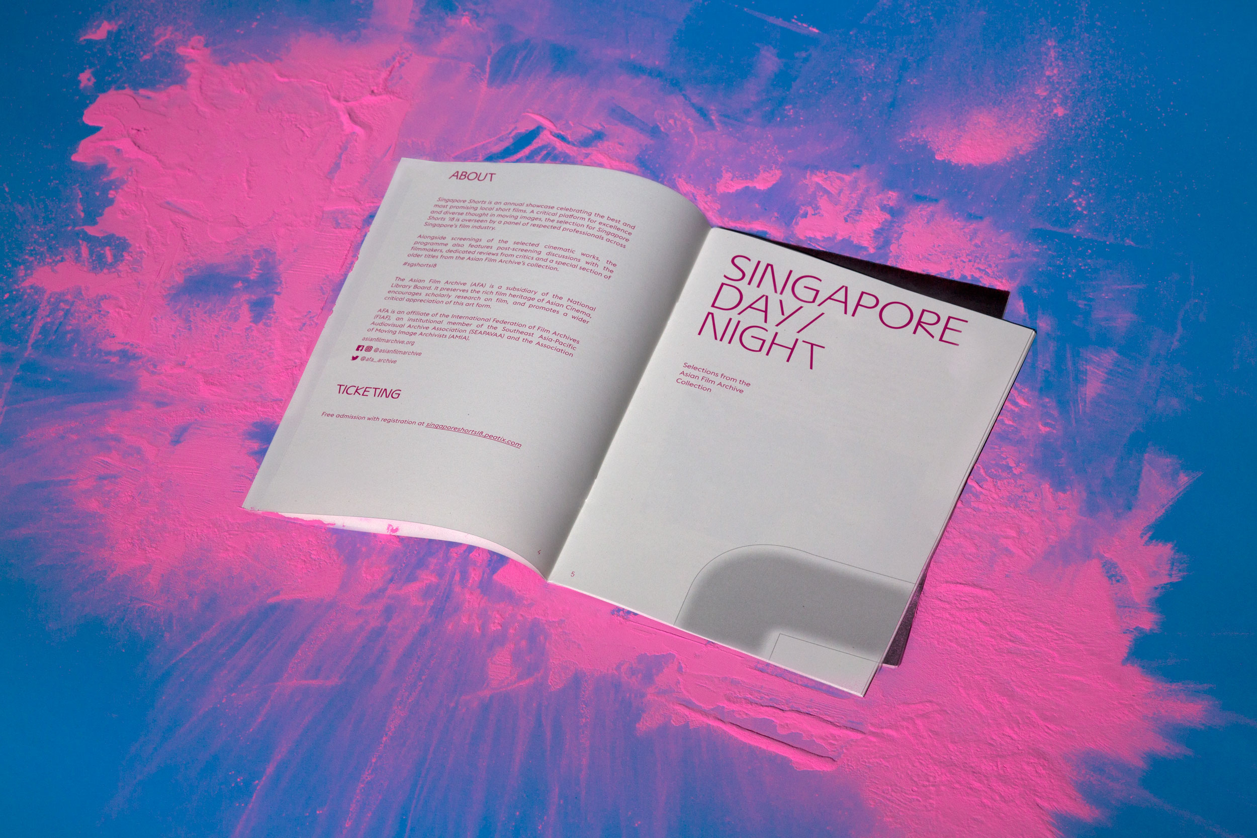
An annual celebration of local short films.
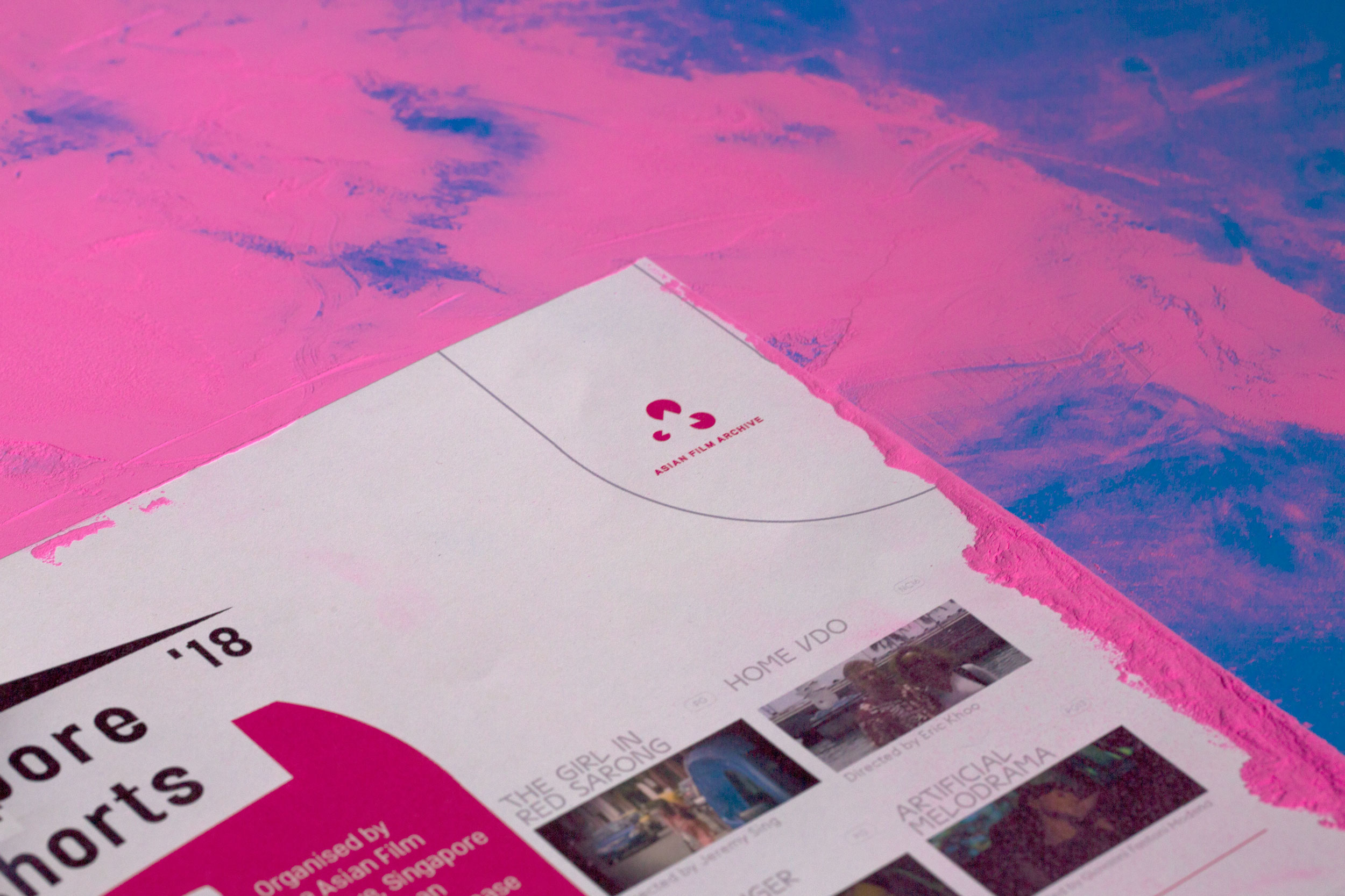
The Asian Film Archive (AFA) aspires to be a hub for the Asian film community, contributing to culture, scholarship and industry through organised screenings, educational and cultural programmes that open and enrich new intellectual, educational and creative spaces, to promote a wider critical appreciation of this art form. Founded in 2005 as a non-profit organisation to preserve the rich film heritage of Asian Cinema, the AFA is a charity based in Singapore and an Institution of Public Character. The AFA won the New Non-Profit Initiative Award at the 2007 National Volunteers and Philanthropy Awards (Singapore) for original, sustainable, impactful and best practices. In January 2014, the AFA became a subsidiary of the National Library Board.


The logotype is set in Elephant (designed by Gareth Hague), a sans serif inspired by classic woodtype grotesques combined with geometric shapes.
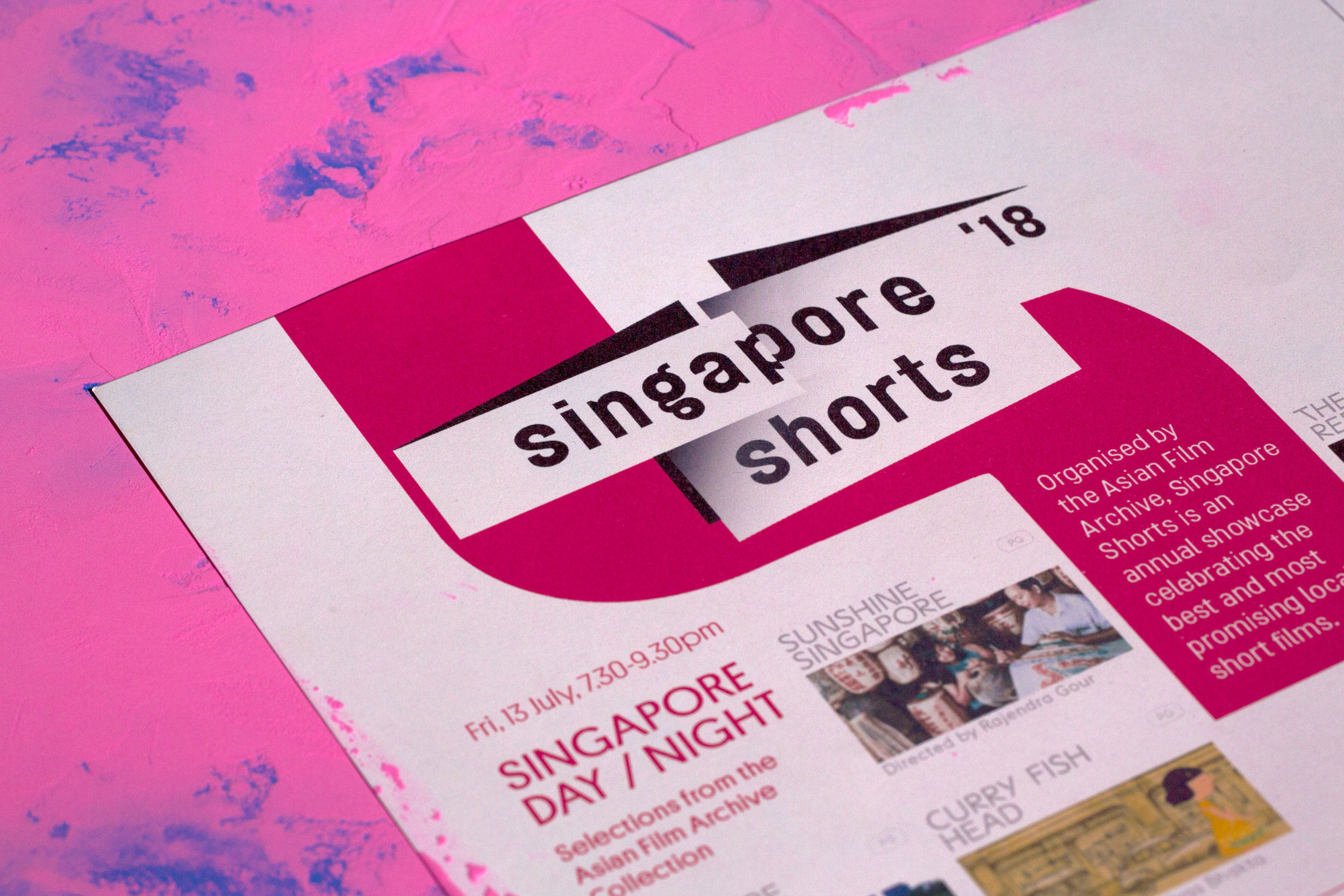
The identity centres around three distinctive stacked blocks which represents the diverse perspectives of filmmakers and audiences. The boldness of the blocks is informed by taking references from elements such as screens, stage and frames. The arrangement of these three blocks conveys the visual metaphor to draw audiences closer to the films, embodying the spirit of connecting the community to short films. To encapsulates the spirit of motion and anticipation and to bring about movement to the static logo, text is intentionally cropped within the blocks.

To complete the experience, the brochure is built around the logo which boldly folded in an unusual manner; creating an illusion of viewing from different perspective mirroring how film is viewed from different angles.
At the heart of the campaign visual is the visual interpretation of anticipation and excitement when discovering a new film. It is bold, lively and inviting. The tube-like channels celebrate connections between films and audiences freely expressed across all communications. The blur effect adds depthness and perspective to the campaign visual.

Do Not Design
Work with us — write to we@donotdesign.com
©2009—2021