Do Not Design for Concrete Cocktail— reimagining the cocktail experience, with accessibility and authenticity in mind
Concrete Cocktail Co.
Services
Research & Analysis
Brand Identity
Communication Strategy
Creative Direction
Design Direction
User Experience
User Interface
Website
Creative direction
Yanda
Design & Art direction
Yanda / Nora James Yee
Collaterals Photography
Anton Tang
Illustration
Ng Si Qi
A project by Do Not Design
A balance of fresh goodness and sublime quality, Concrete Cocktail promises an authentic, distinct experience. No more pretentious, scam-ey cocktails— they mix, you pour.
Cocktails are more than just a drink but rather, a start to a great night with friends, or alone (if that’s what you prefer). We crafted a bold, approachable identity for Concrete Cocktail. In a relatively small and niche marketplace, we needed to deliver a distinctive brand experience that would evolve their identity for the next era of growth. This translated even throughout the rebranding process, from its logo to the packaging of each bottle. Like its name, the new identity of Concrete Cocktail takes inspiration from, you guessed it— concrete!


To reflect a sense of flexibility and inclusivity, we created a logo that wasn’t strictly defined. Depending on the occasion (or not) the hand gripping the bottle can be replaced with one of many variations of hands. In the same spirit of ambiguity, the logotype consists of variations of scribbled-inspired typefaces, which is reminiscent of the name scribbles on an unfinished glass of drink at a bar.


Looking good is only the baseline. We take it one step further with our bold ideas.
Looking good is only the baseline. We take it one step further with our bold ideas, and create irresistible brands, each with a distinct personality that captivates and engages with its customers across the customer journey.


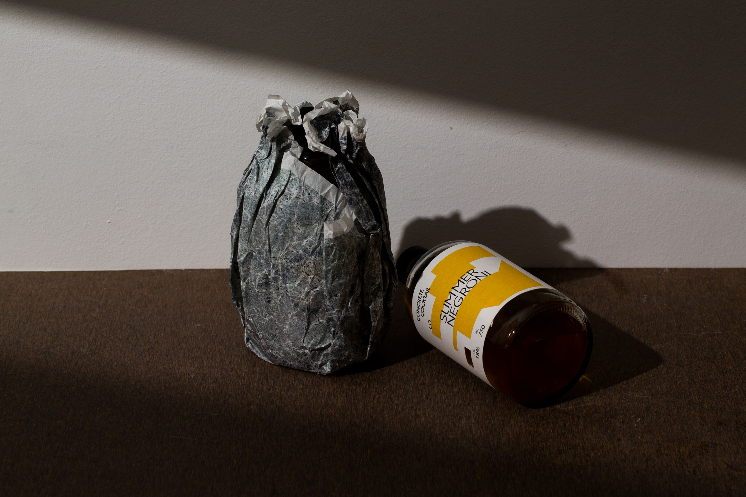
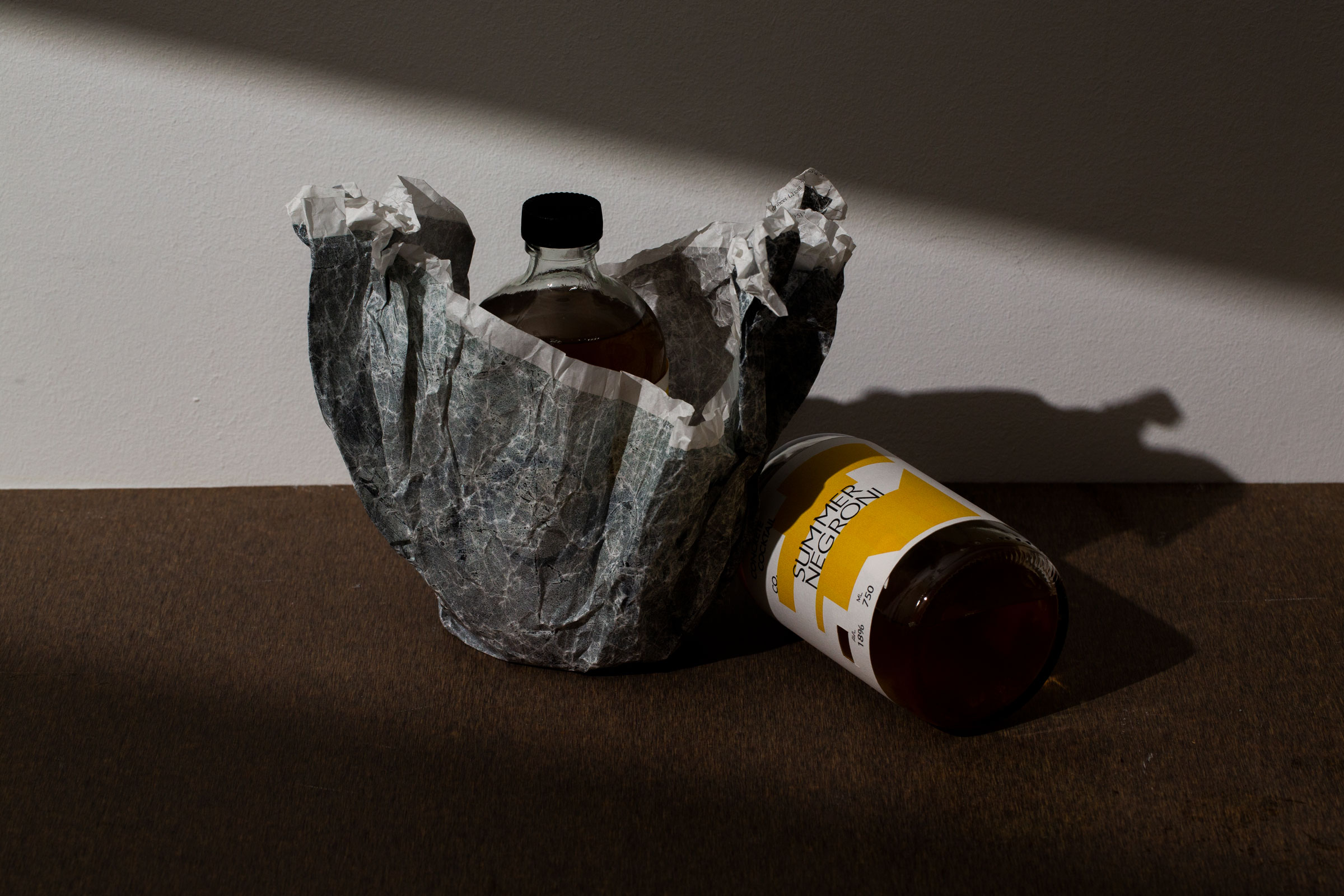
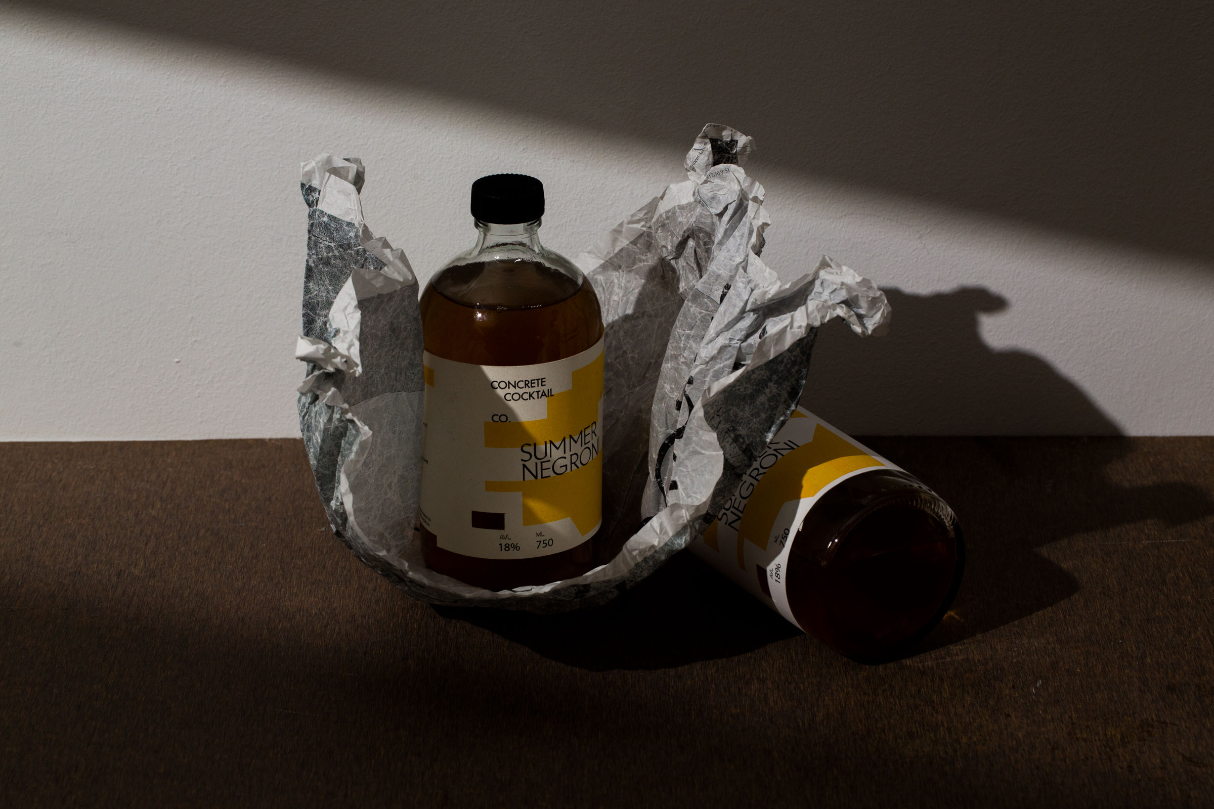
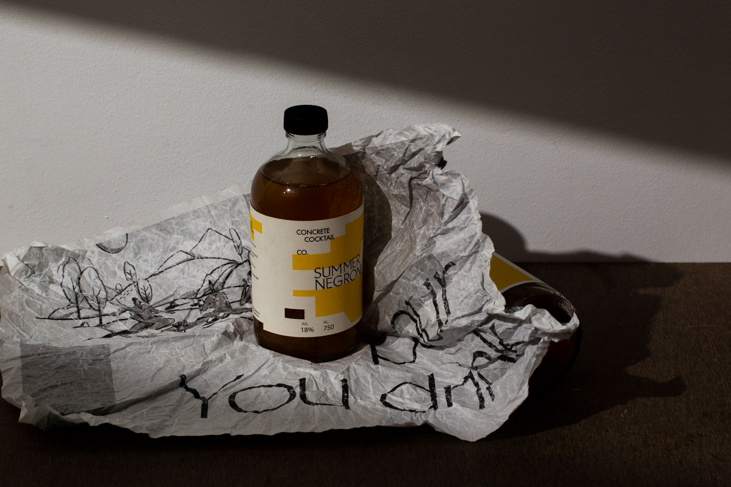
Wrapped in concrete. Just as its name suggests. Concrete Cocktail’s bottles reflect the brand at its essence: authentic and distinct with its concrete-inspired paper wrapping.
Because design should never compromise function, we took the journey a bottle takes to its receiver into consideration. More than just its literal meaning of a ‘concrete cocktail’, the paper wrapping cushions the bottle giving users an unboxing experience that isn’t commonly known to cocktails.


Do Not Design
Work with us — write to we@donotdesign.com
©2009—2021