Do Not Design for The Future of Our Pasts – reintegrating Singapore’s storied past into the future
The Future of Our Pasts
for Yale-NUS
Services
Festival Identity
Creative Direction
Design Direction
User Interface
Website
Spatial/Exhibition Design
Creative direction
Yanda
Design & Art direction
Edward Harland / Elizabeth Zhang / Evangelyn Ong
Illustration
Elizabeth Zhang
Printing
Allegro Print
Construction
2ideas
A project by Do Not Design
The Future of Our Pasts (TFOOP) is a month-long festival exploring lesser-known stories of the past and present— reimagined through artistic mediums.
Organised by Yale-NUS in support of the Singapore Bicentennial, TFOOP Fest ran from 16 February to 17 March 2019 at various locations around the city. TFOOPFest is a festival organised by Yale-NUS College, in support of the Singapore Bicentennial. Taking place for the first time in 2019, the festival featured 11 projects that reimagined lesser-known stories of communities and places of Singapore’s past through creative mediums. History is often perceived as static, monolithic and boring. In Singapore, what comes to mind when one thinks of history is common narratives and images. But what about some of the smaller, micro-narratives that might have slipped through the canals of history?


Do Not Design was commissioned to develop the festival’s identity and branding, spanning across digital, print and spatial mediums. Inspired by the connectivity of the future and the past, the festival’s identity is an interpretation of a string as a symbol of a progressive entity running through the times–– from past to present. Set in Elephant (designed by Gareth Hague), the logotype is a sans serif font inspired by classic woodtype grotesques with nuances of geometric shapes. A string intertwining through the title also emanates a perception of depth running throughout.
Exhibition Launch


Noteworthy tactile elements were infused into the spatial solutions as part of the festival’s launch party, further immersing visitors into a holistic experience.


The brilliance and vibrancy of the future is represented by an unmistakable, fluorescent orange which perfectly juxtaposes with the festival’s historical imagery and references.


Consistency throughout all touchpoints creates opportunity for free promotion. The striking fluorescent orange on the tote bag makes it outstanding amongst the overwrought public spaces, acting as a walking billboard to garner more attention for TFOOP.


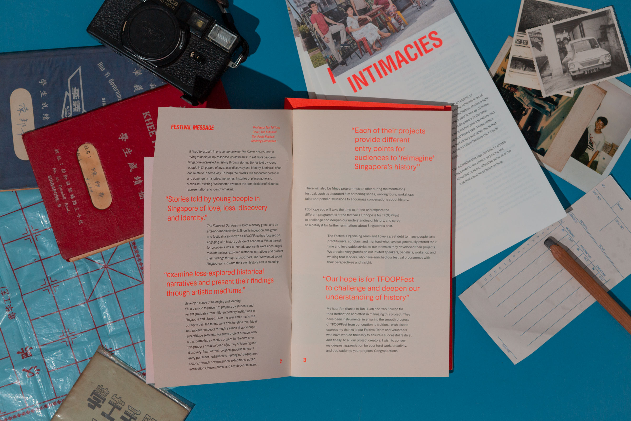
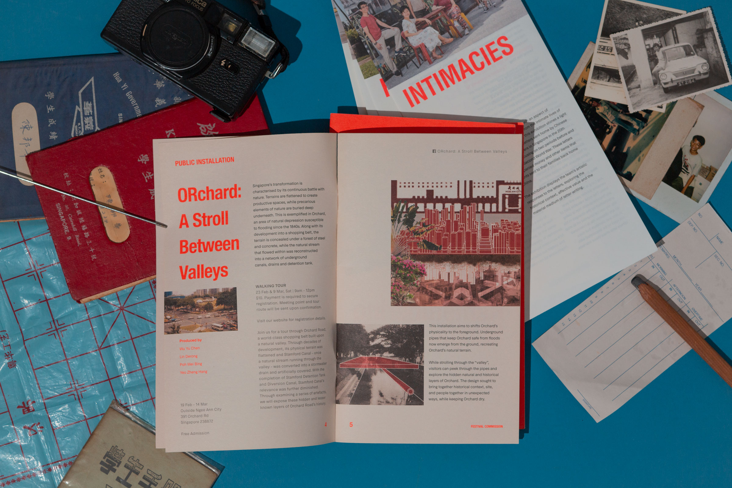
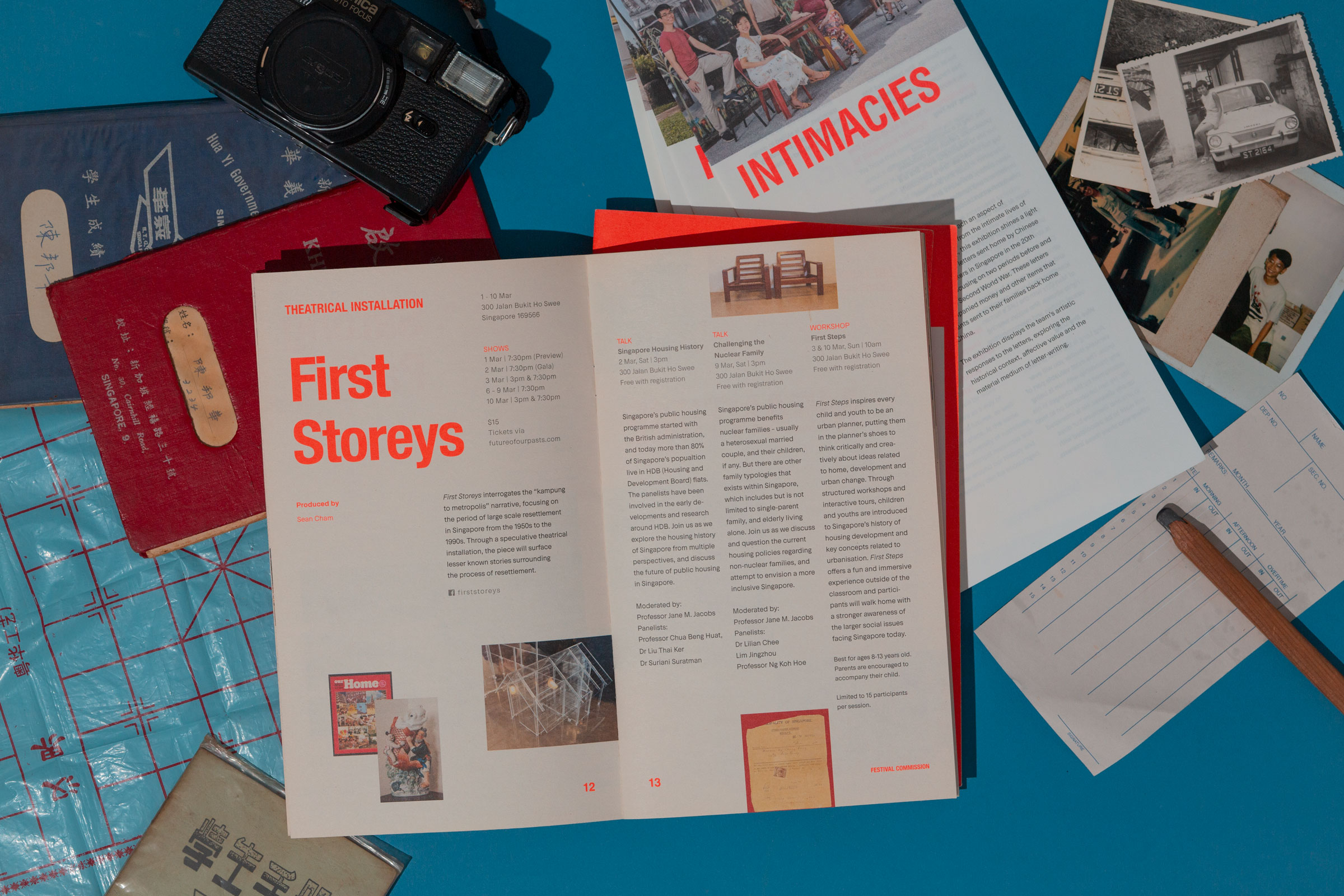
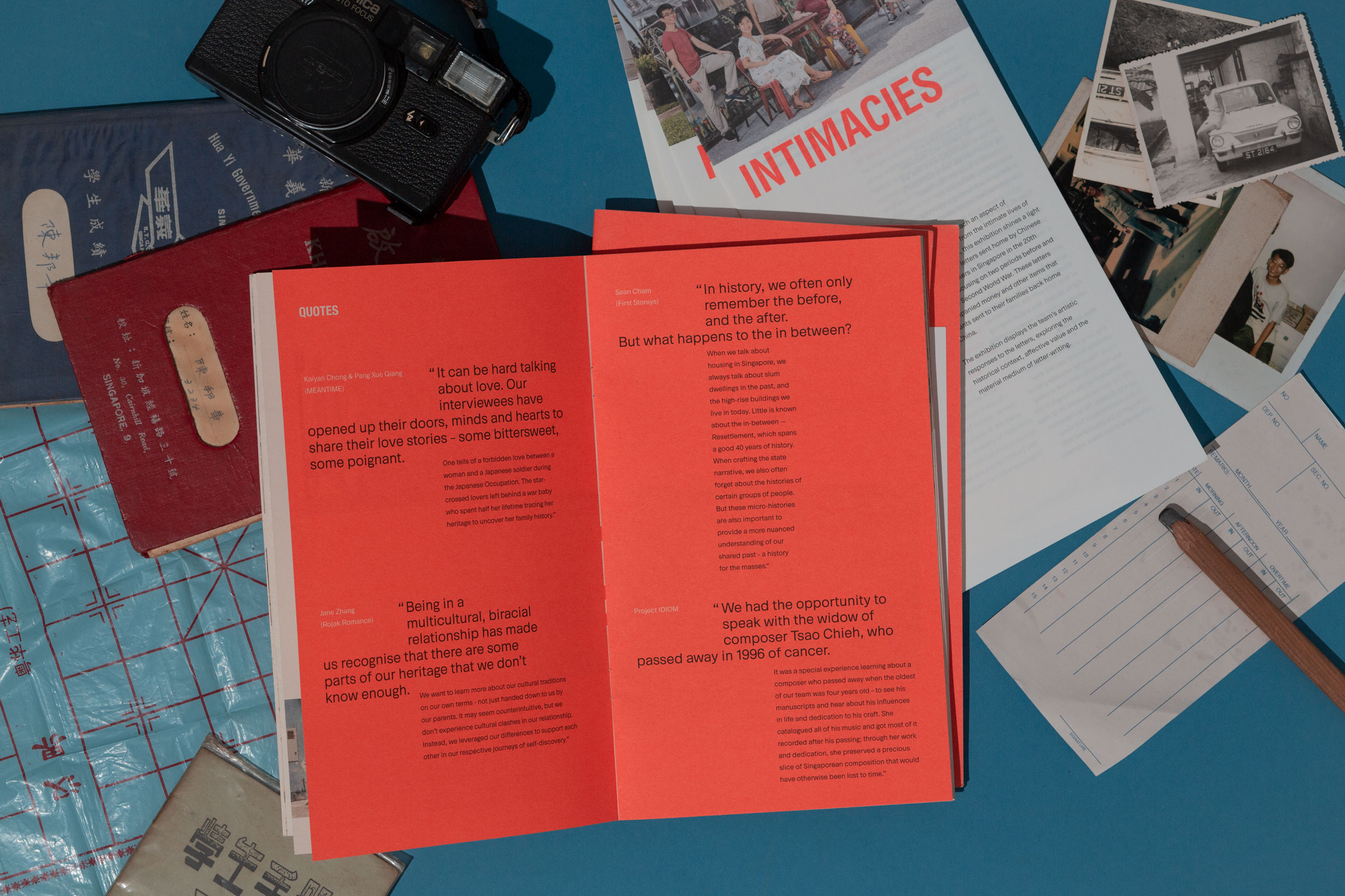
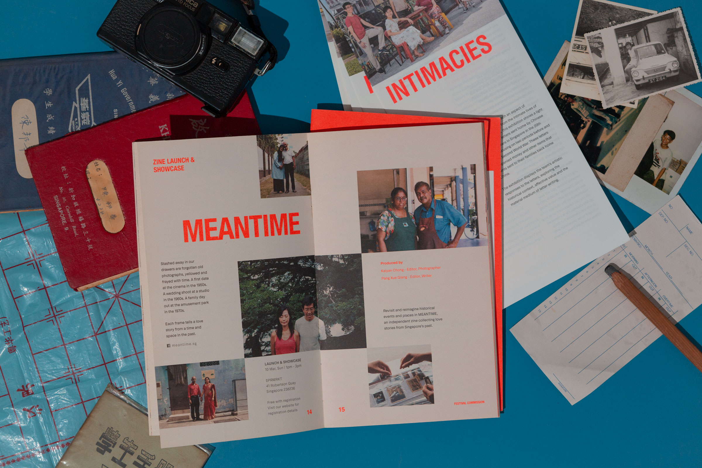
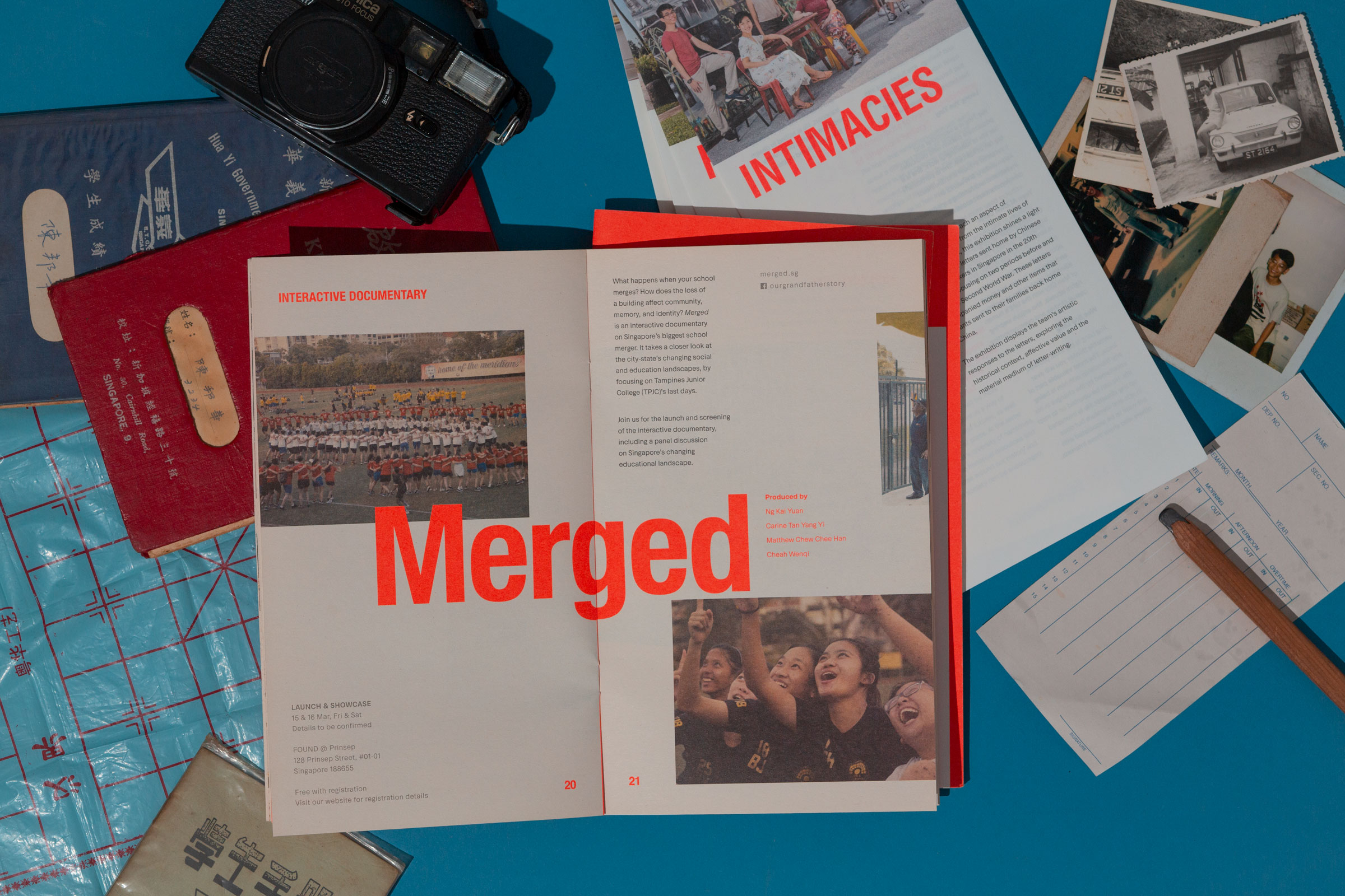
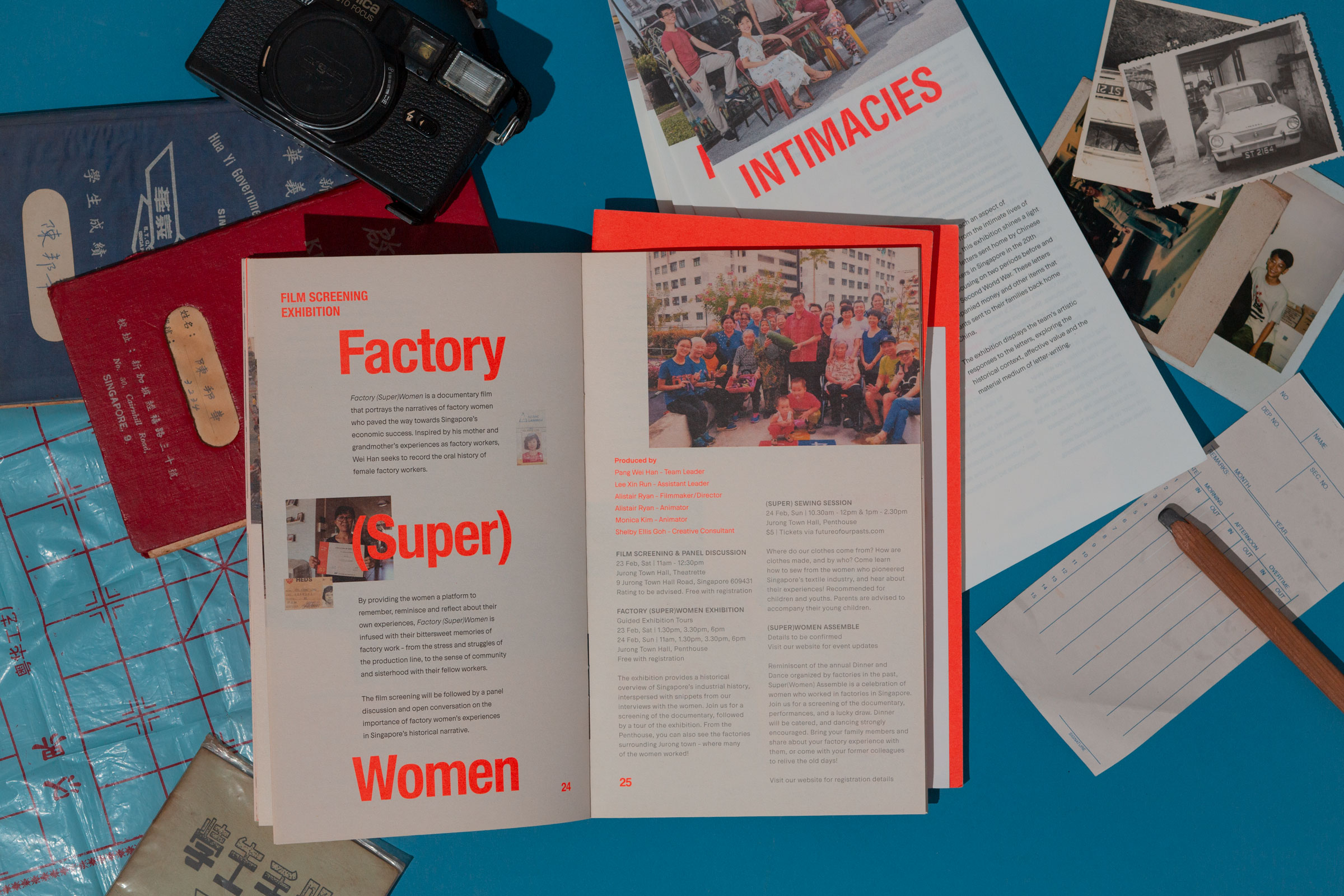
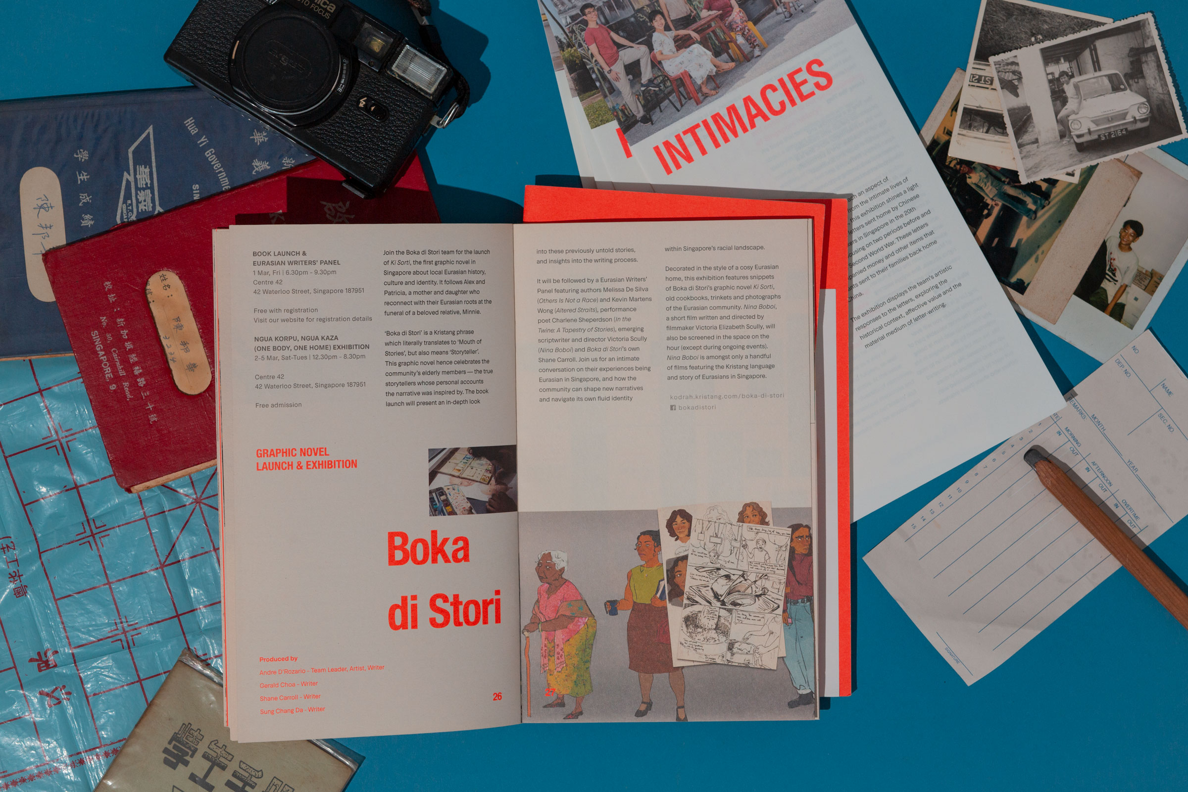
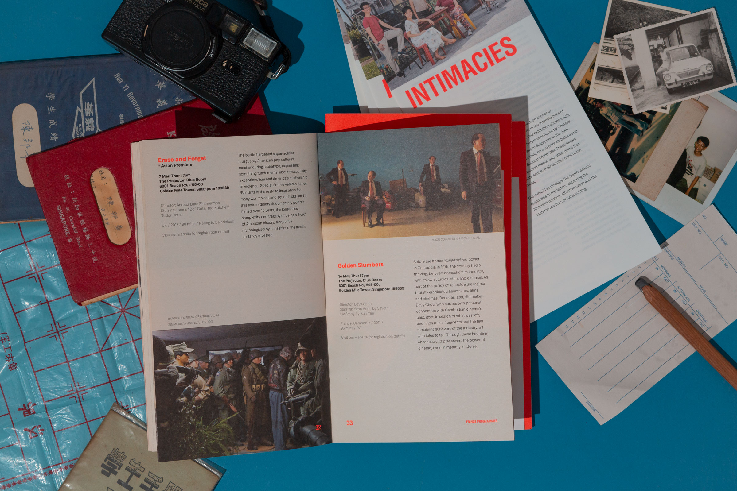
Straying from the orthodoxy of event guides, unique editorial techniques were incorporated into the typical brochure format. While minute, these subtle details transform the conventional into something engaging, a visual arrest that demands attention from visitors.


Do Not Design
Work with us — write to we@donotdesign.com
©2009—2021