Do Not Design for N-Tyler— honouring design while breathing new life into menswear classics
N-Tyler
Services
Creative Direction
Design Direction
Art Direction
User Interface
Website
Creative direction
Yanda (in collaboration with Uniform)
Design & Art direction
Yanda / Sherylene Chew / Cherie Chong
Printing
AlsoDominie
A project by Do Not Design / Uniform
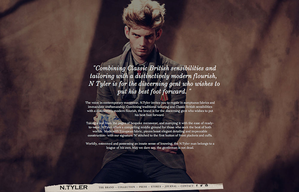
N Tyler combines traditional tailoring and classic British sensibilities with a modern flourish to create a look that is perfect for the urban genteel.
In collaboration with Uniform, Do Not Design was commissioned to work on the art direction and design from the campaign, lookbook to website and marketing assets.
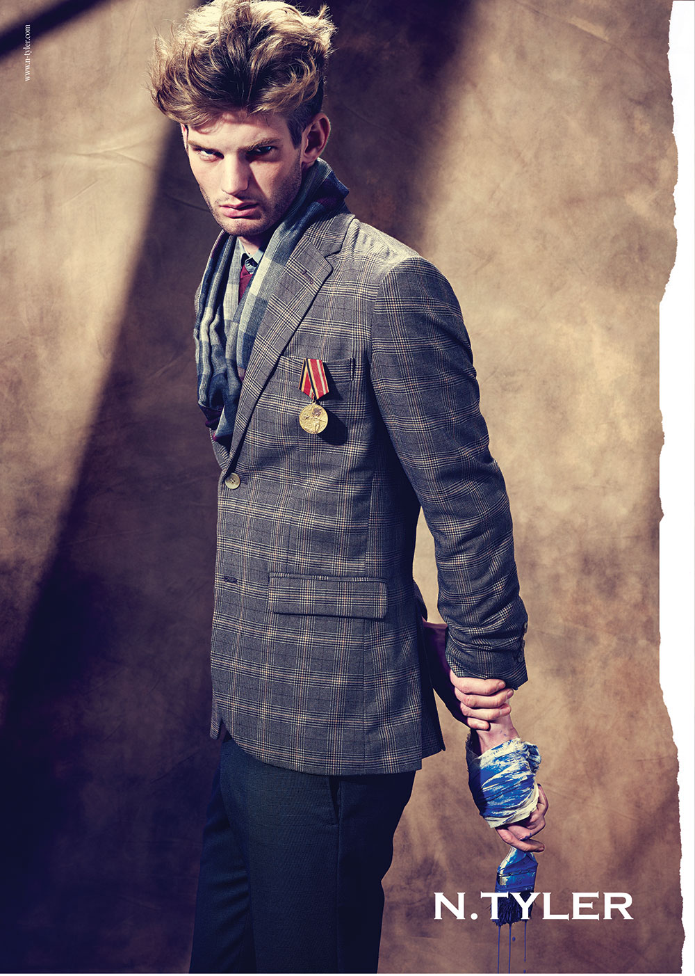
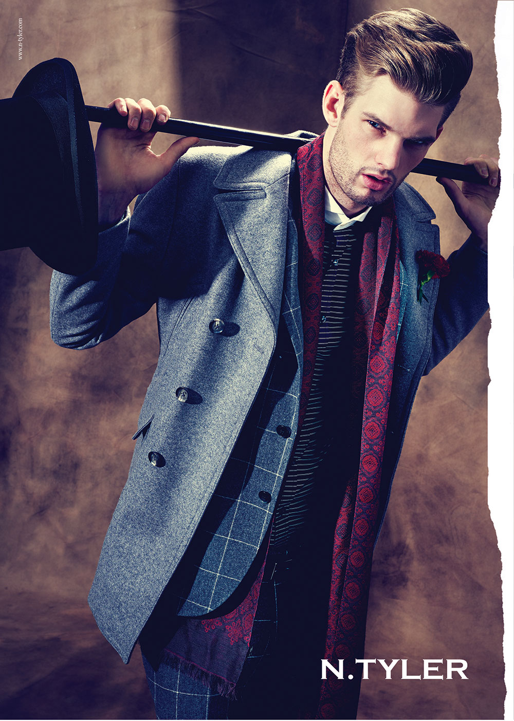
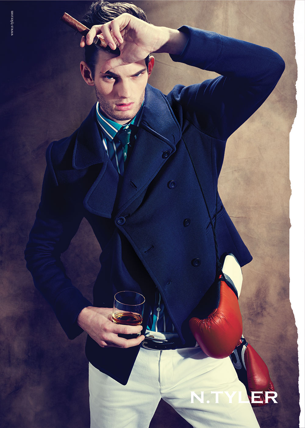
Titled ‘The Importance of Being’, the entire campaign photographed by Joel Low muses over the unique sartorial beat of gentlemen—the Genteel Patriarch, Self-Made Man and Heroic Artisan. These are the apostles from the fashion bible our fashion evangelists fervently worship.
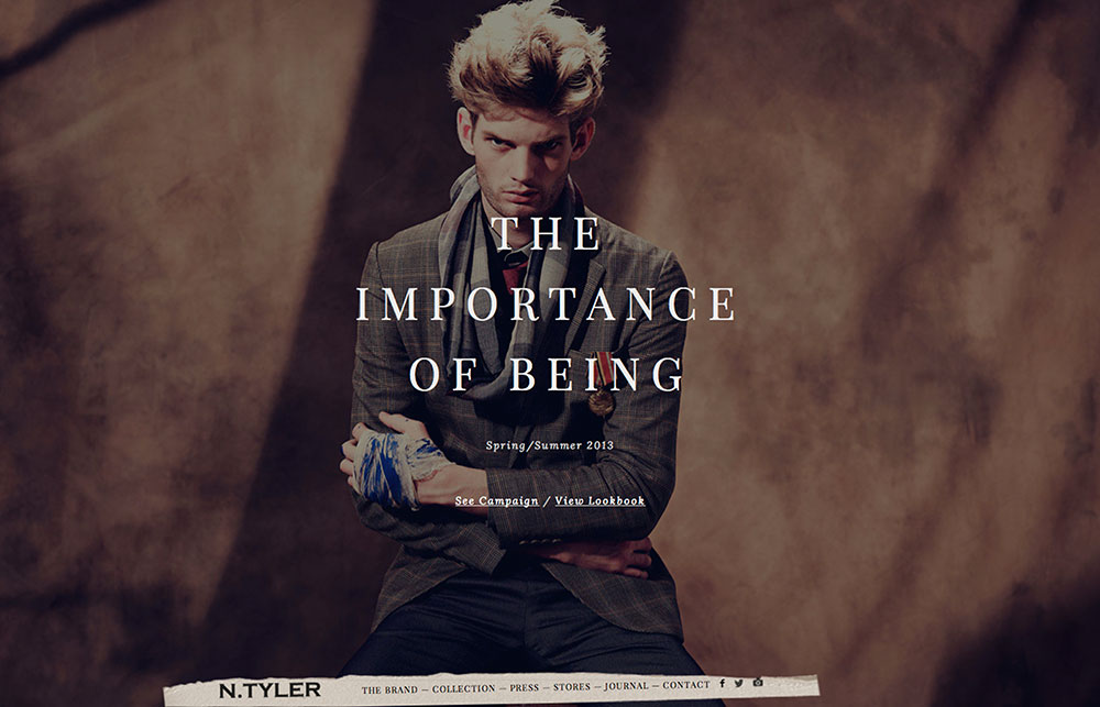
The advertising campaign mimics the idea that it is a page torn off from the fashion bible
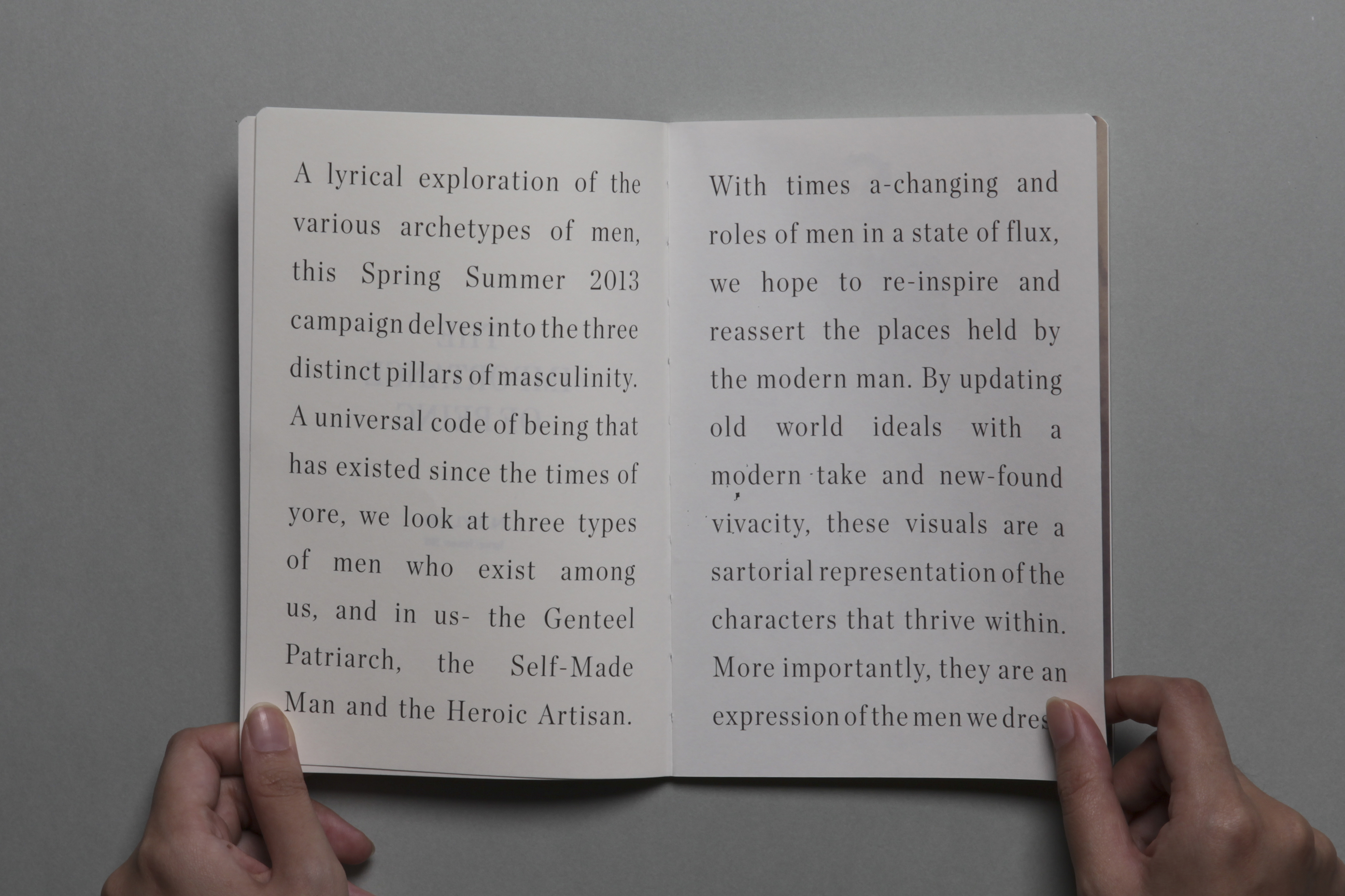
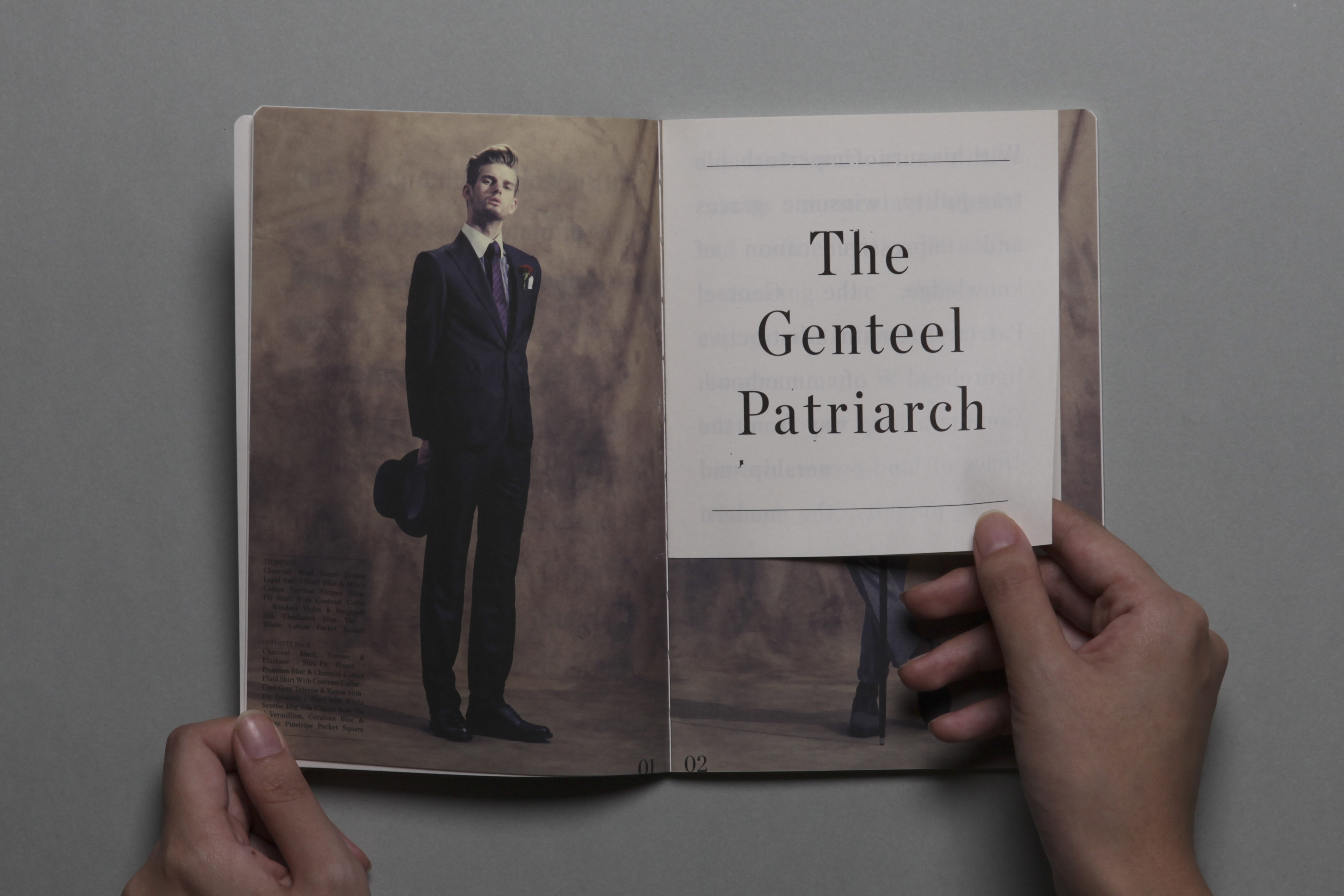
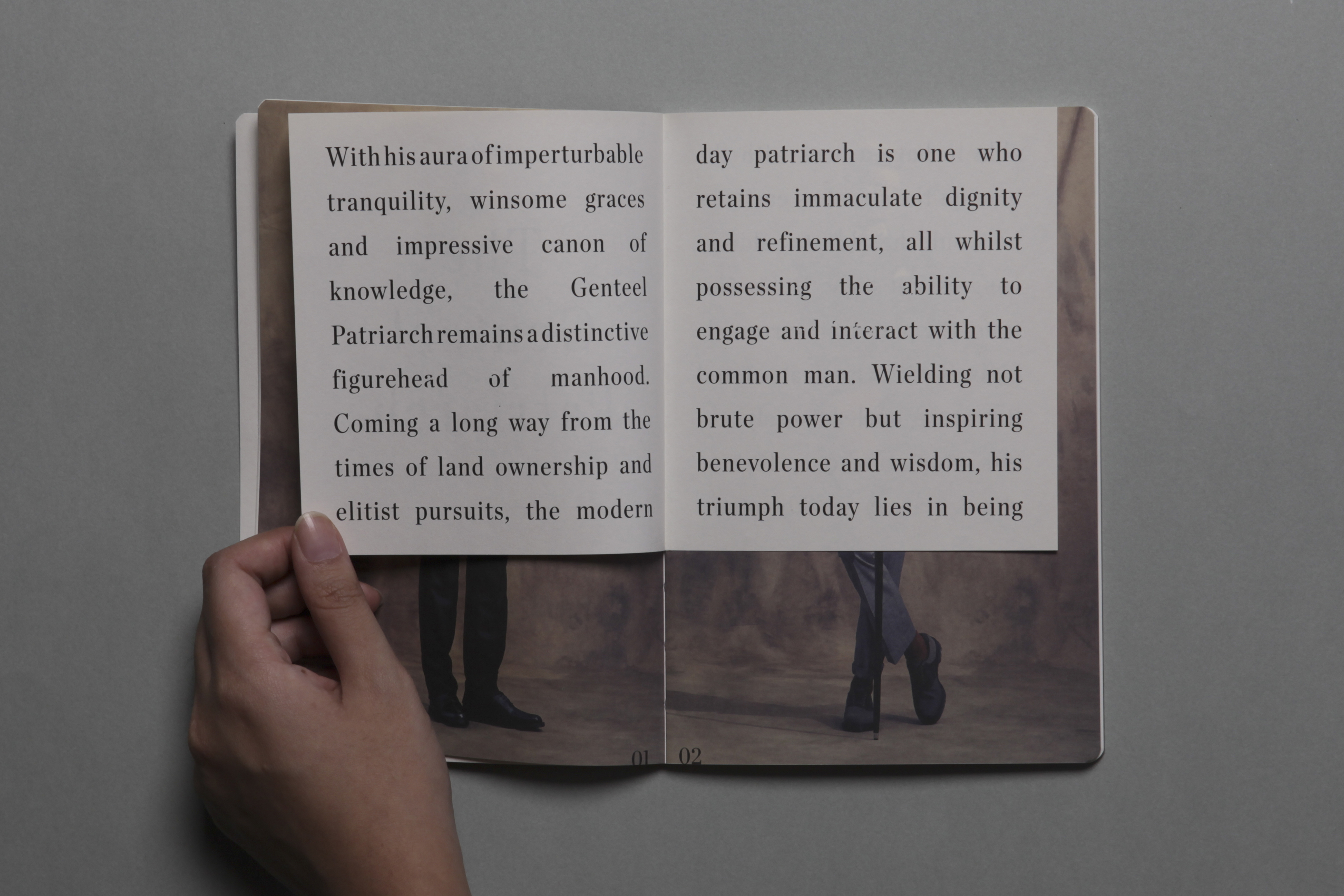
LOOKBOOK
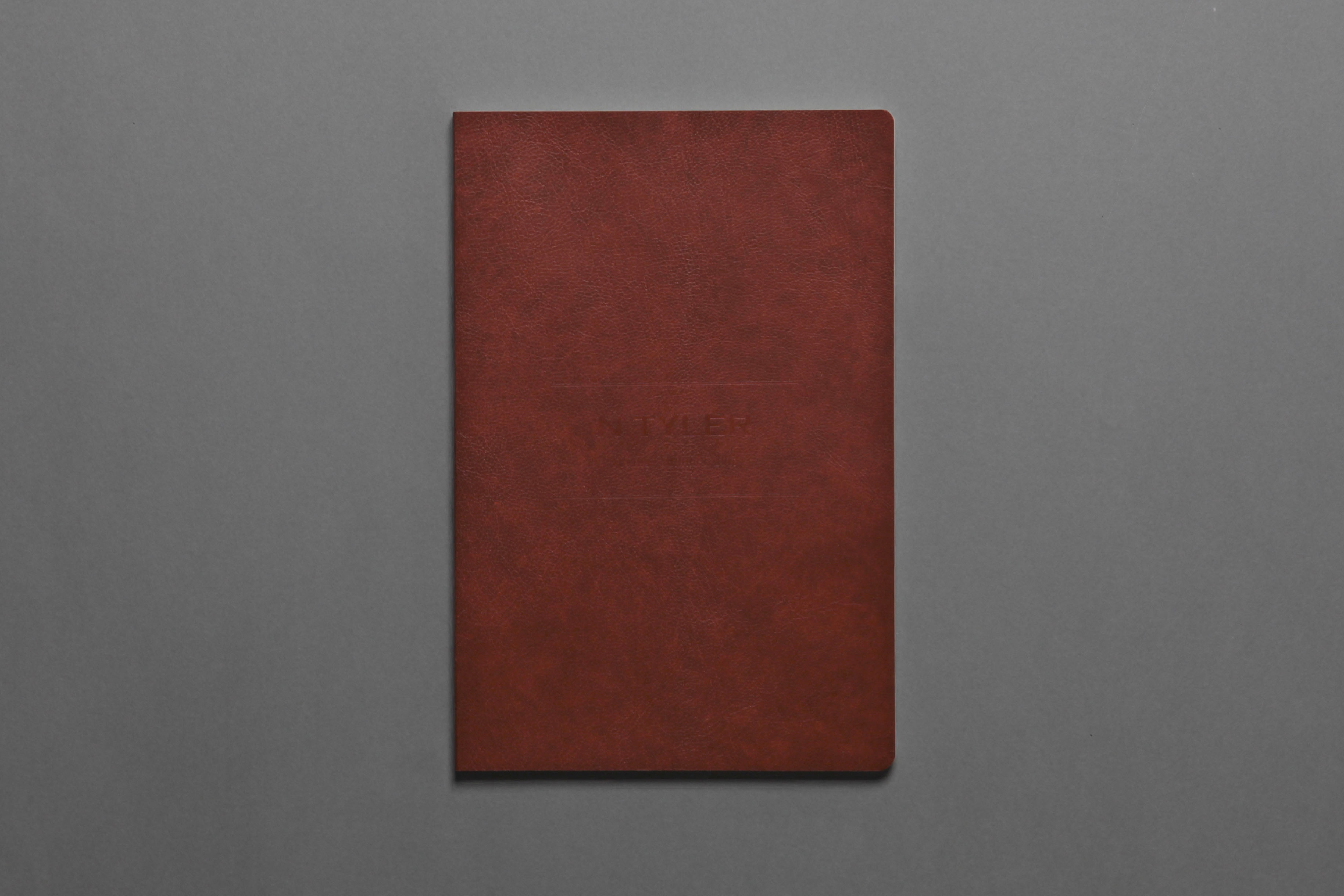
To encourage more pick-ups and also to use the look book as a marketing tool on its own, we proposed to make the book more desirable and instagramable.
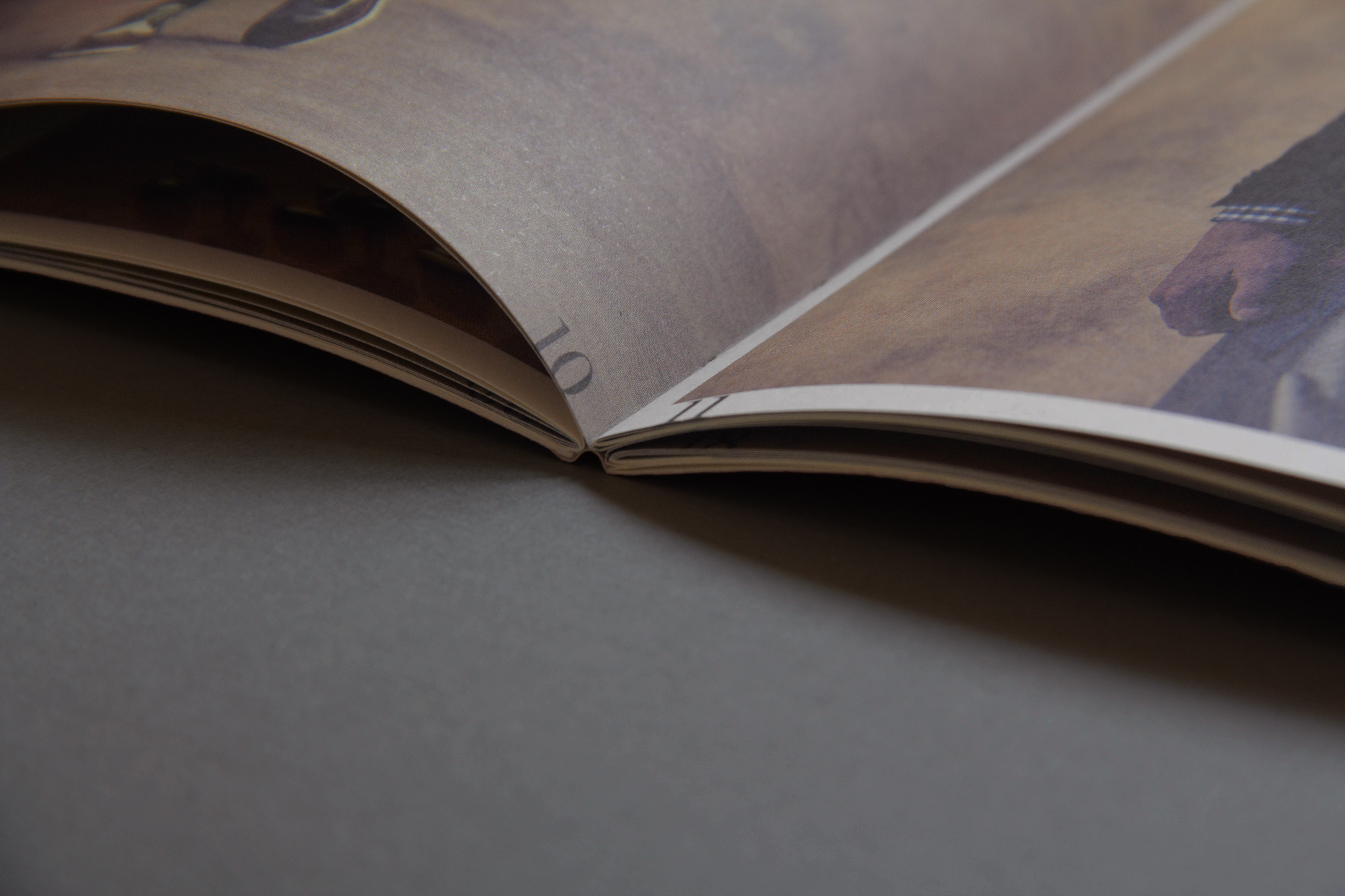
We drew inspiration from the book of all books‚ the Bible—leather bound cover paper is sourced from Belgium and finished with pearl foil stamping; Lightweight textured paper for the inserts and cream coating paper for the whole book were used to mimic the aesthetic of the Bible. Large text ensures easy to read. Corners of the look book adopts a rounded-cut to prevent dog-ears.
Each colour and piece of merchandise was also named so that they can be marketed individually when needed.
‘
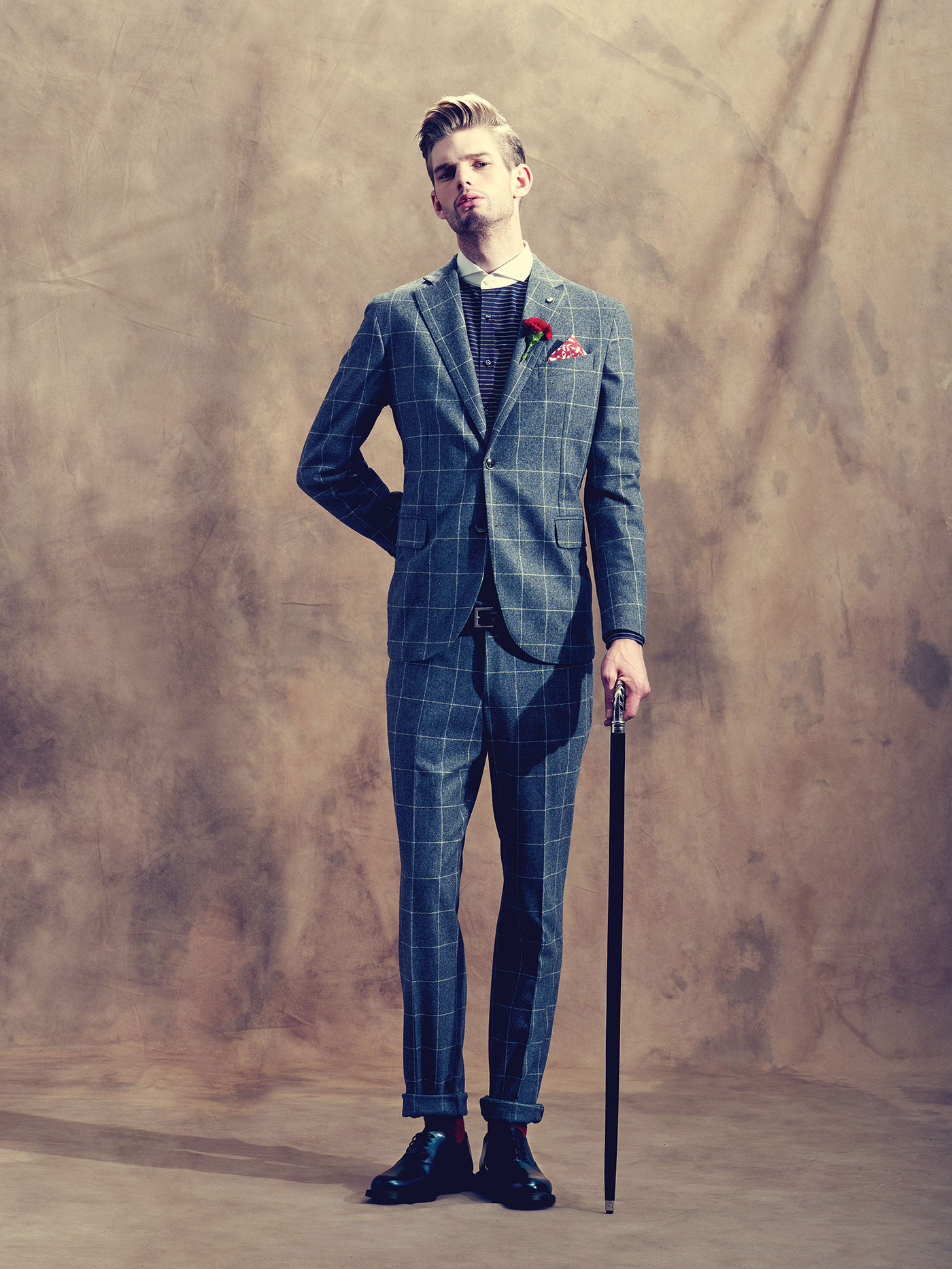
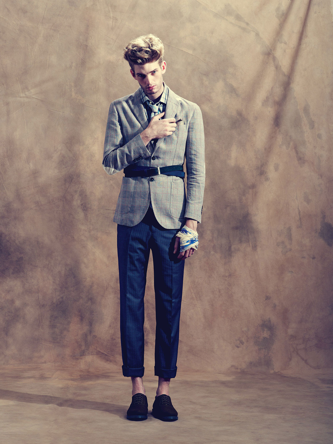
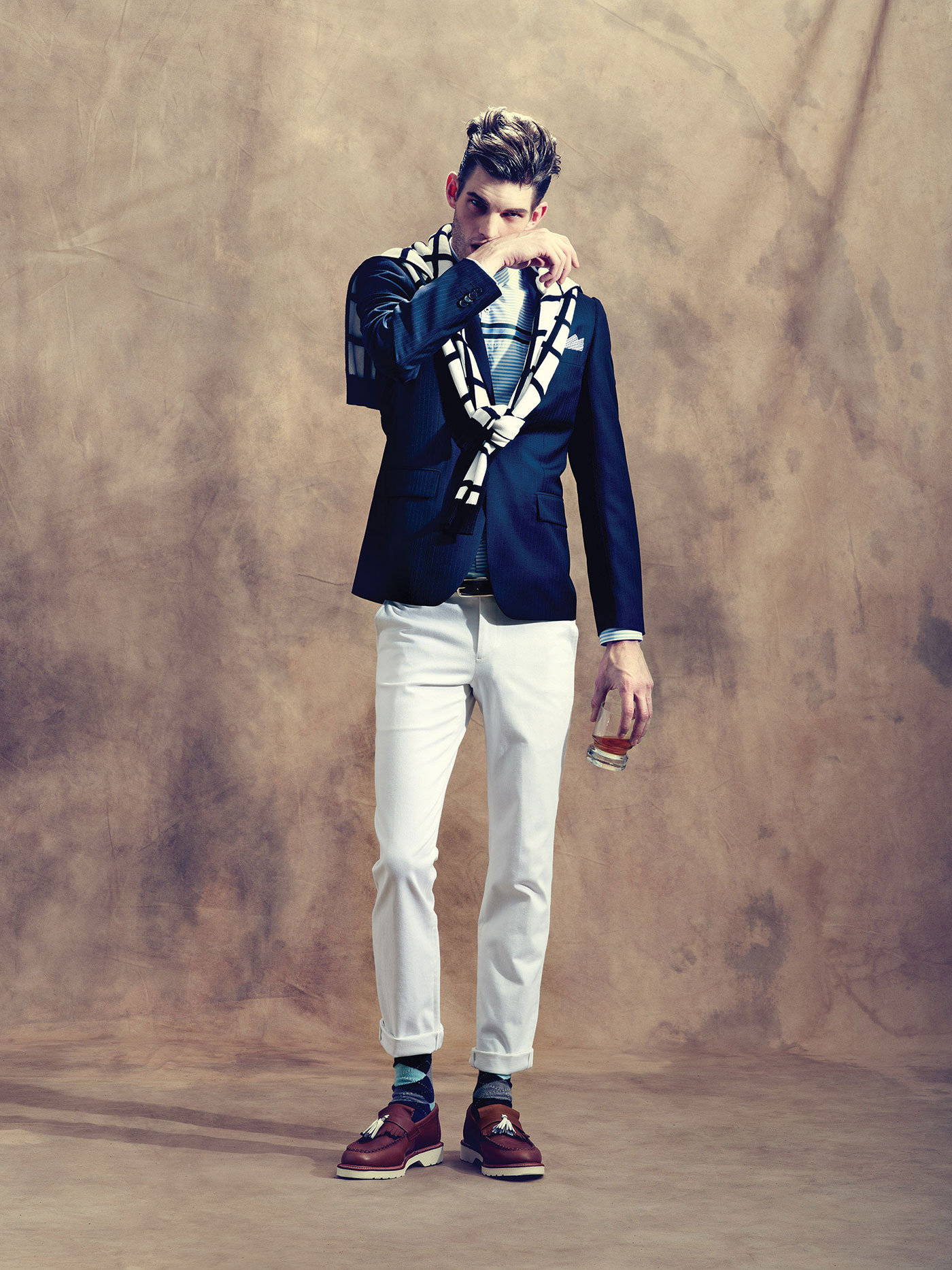
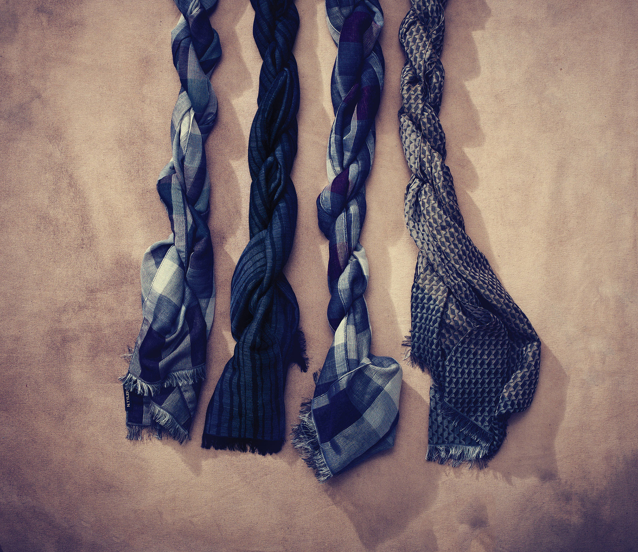
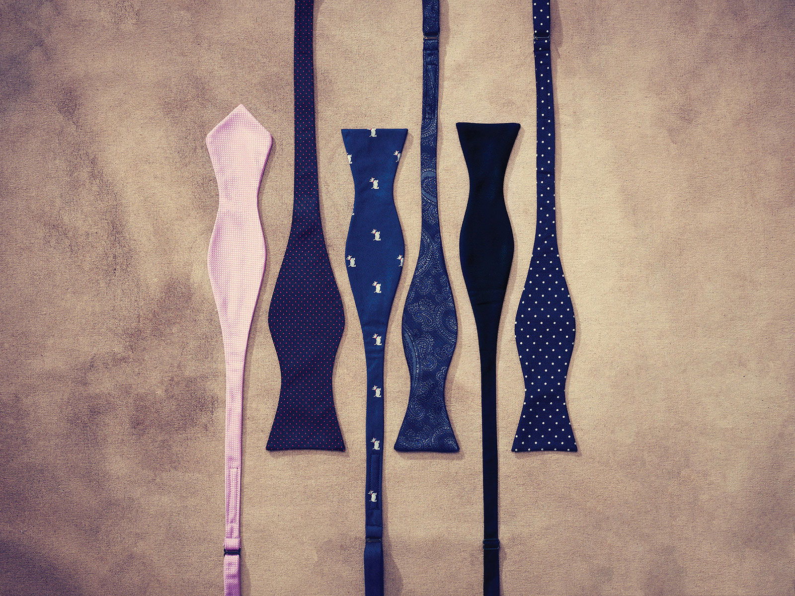
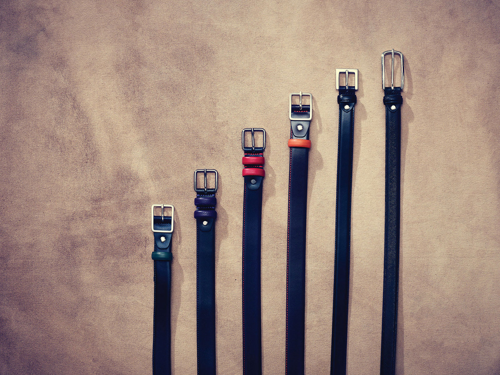
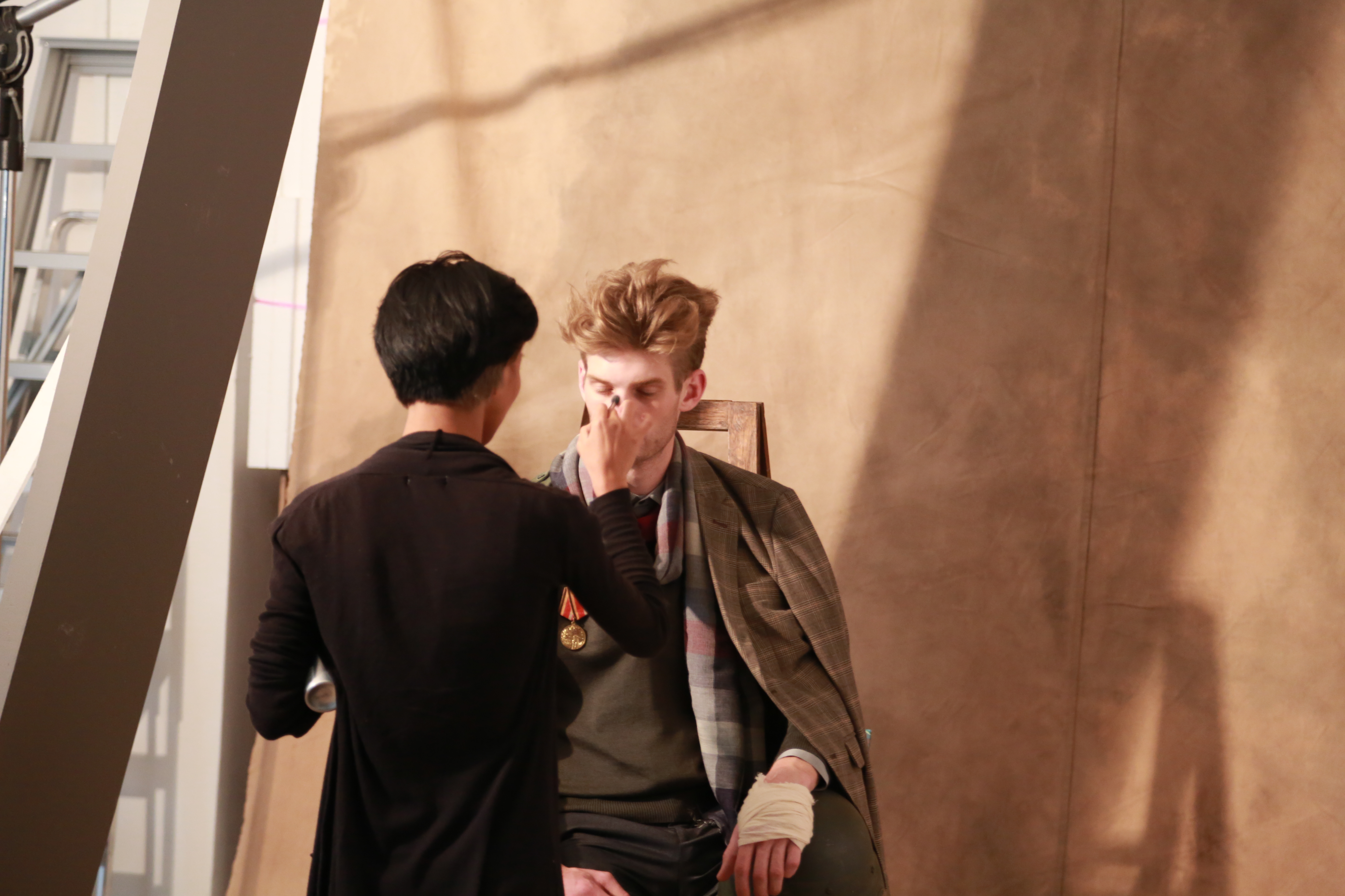
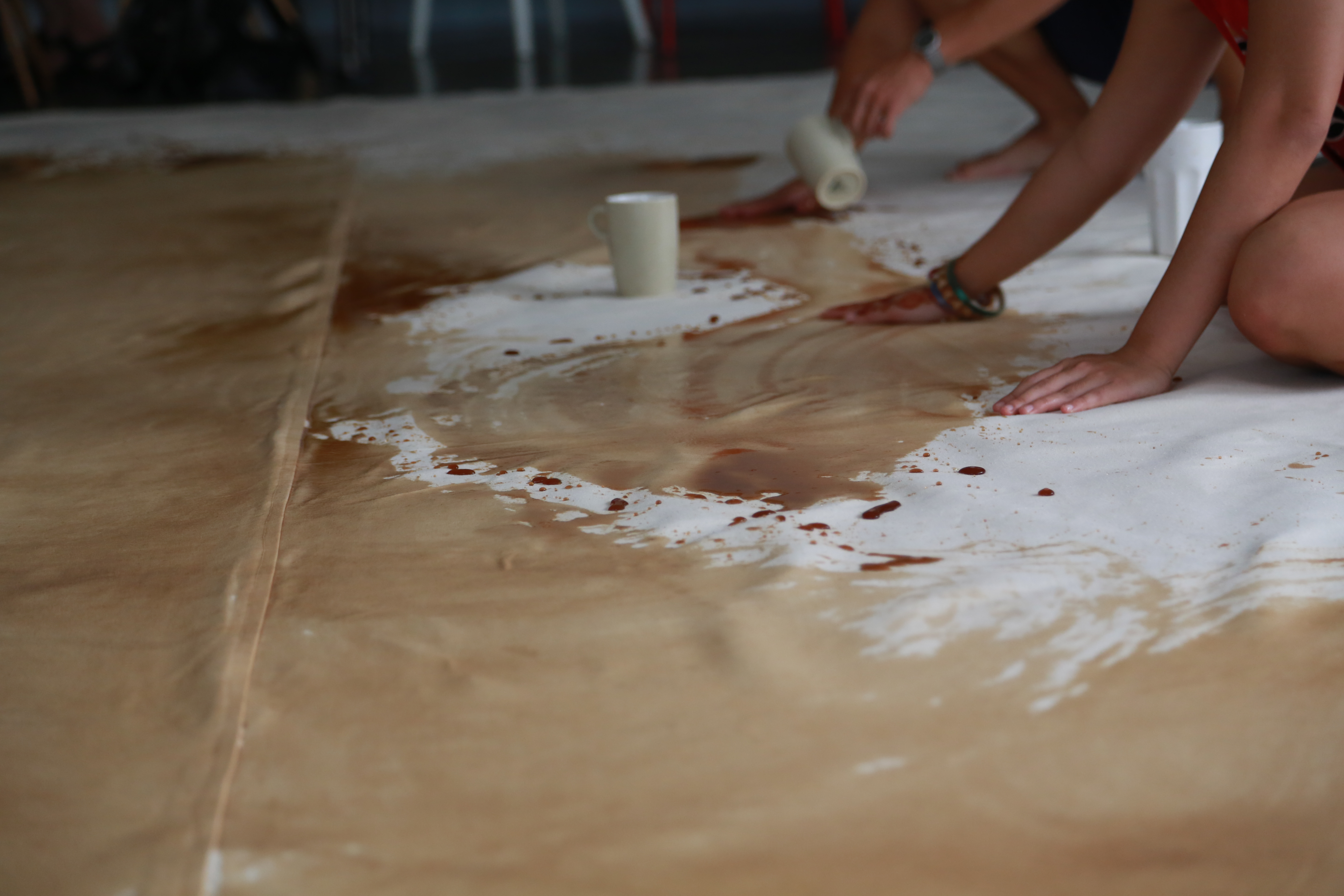
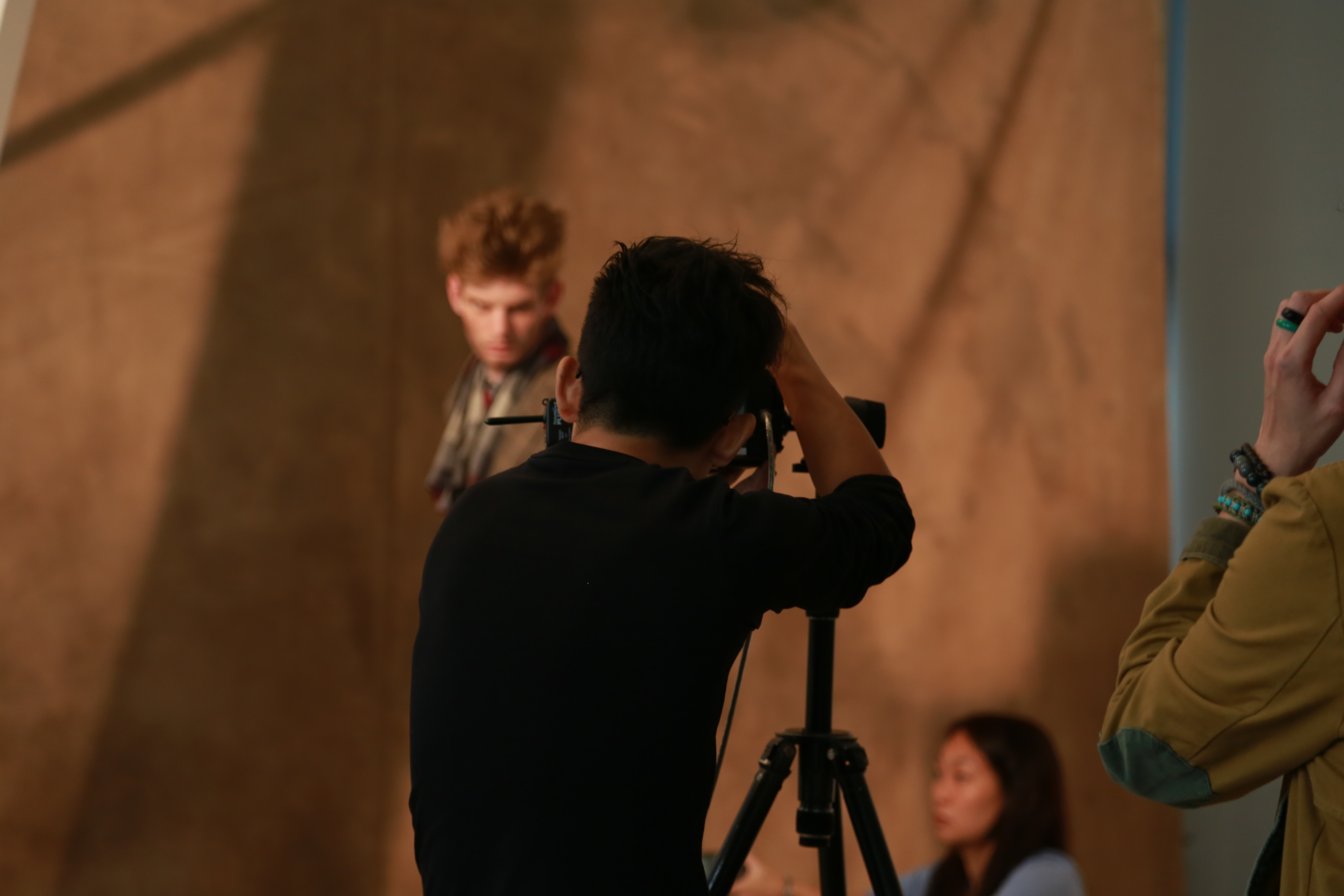
From backdrop of the photoshoot where we hand-dyed and stain ourselves with coffee, to the styling and art direction. everything has been taken care of—rolled-up pants, matching socks, hats, pocket squares, ties, bow-ties, shoes to props to bring out the character of each look.
DIGITAL MARKETING
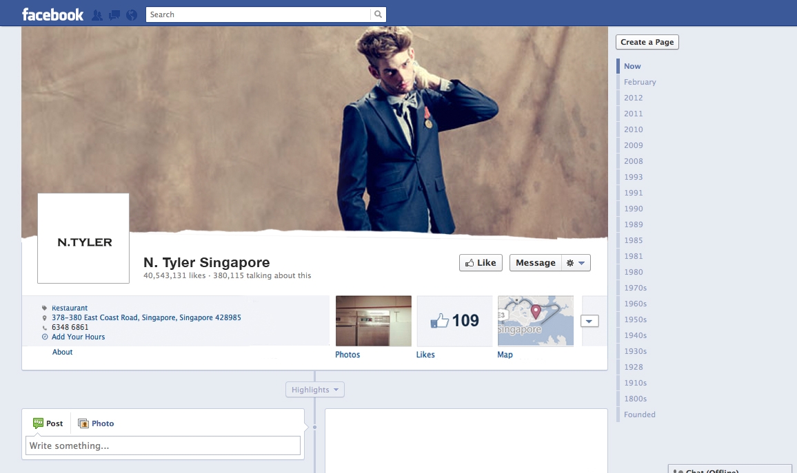
To appear as if a fashion evangelist had taken the inserts from a fashion bible to create this catalogue, a torn effect was used for the website and the digital marketing assets.

RESULTS
There was a distinct increase in the number of pick-ups, interests and praises on the new book as opposed to the previous years where they were just another glossy paper printed material.
The whole rebrand made the label exciting and refreshing again and we were able to reach out to an even new audience in stylists.
Free media was earned when the campaign were featured in fashion websites and design coffee table books.
Do Not Design
Work with us — write to we@donotdesign.com
©2009—2021