Do Not Design for Alchemist— an everyday affair meets sophistication for a growing coffee chain
Alchemist
Services
Research & Analysis
Brand Positioning
Brand Identity
Communication Strategy
Creative Direction
Design Direction
Wayfinding & Signage
Creative direction
Yanda
Design & Art direction
Yanda / Nicole Then / Tan Yie Xuan / Wee Yen
Illustration
Tan Yie Xuan / Wee Yen
A project by Do Not Design
Alchemist is a coffee chain that fuses the magic of coffee craft and science to create an authentic experience for its customers.
In rebranding Alchemist, we sought to position the brand such that it could comfortably expand into new product categories and markets, while retaining its modern and distinctive touch.
As part of our strategy, we developed a distinctive visual language that exemplifies the precision and simplicity of Alchemist’s coffee. The designs are a harmony of classic and modern, evoking a sense of peace and calm that lets customers truly experience the magic behind thoughtfully brewed coffee.
Branching from the elements of alchemy, an ancient branch of natural philosophy related to magic, mythology and chemistry, Alchemist’s logo stems from a flask with a slanted opening (which is reminiscent of a potion bottle).

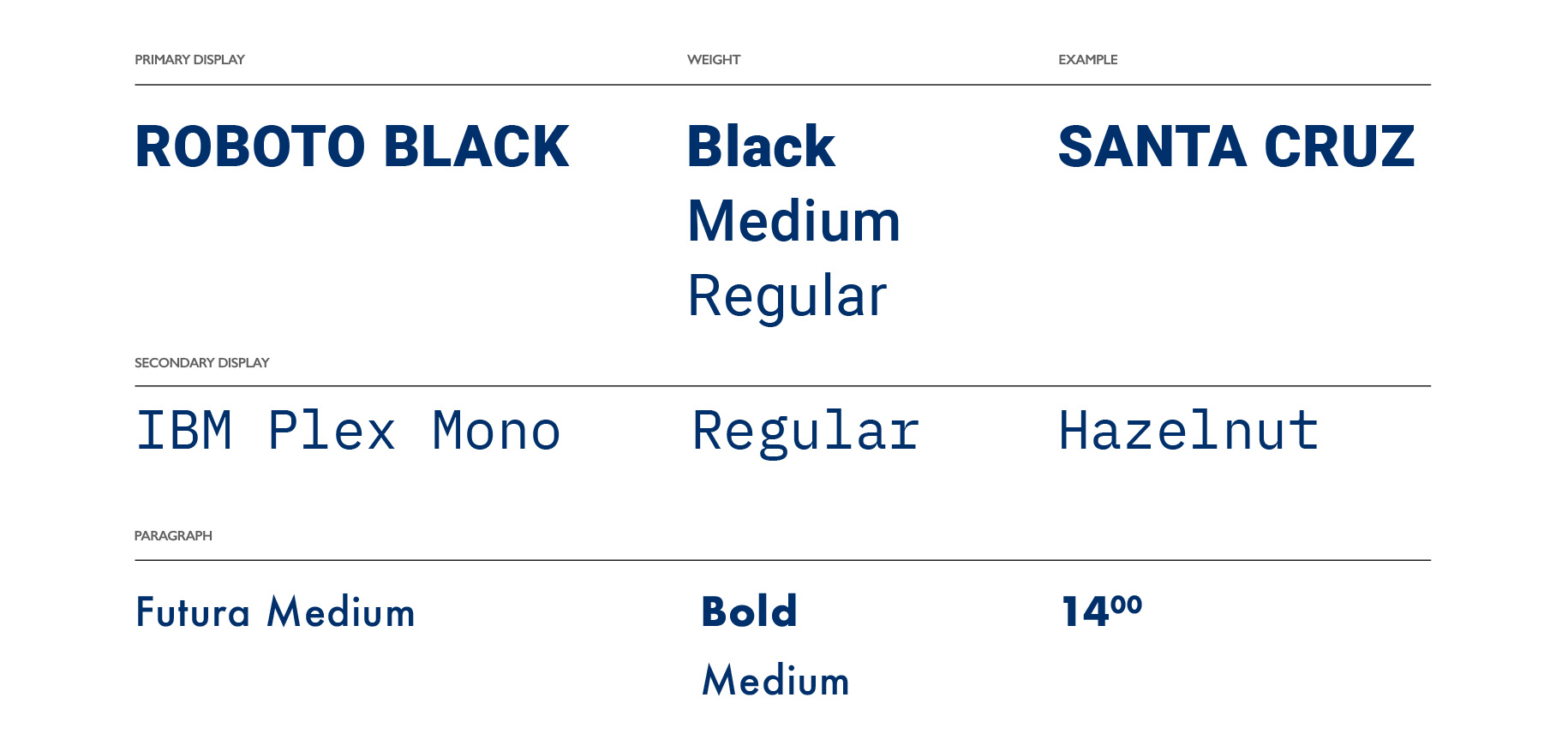
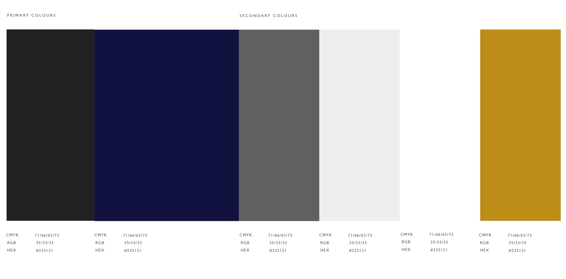
Alchemist’s colour palette consists of black and blue, with the occasional yellow hue that punctuates fun and personality where needed. More importantly, the signature blue shade that wraps the coffee chain’s walls and packaging was carefully selected to— you guessed it: instil a sense of tranquility and calm while enjoying coffee.
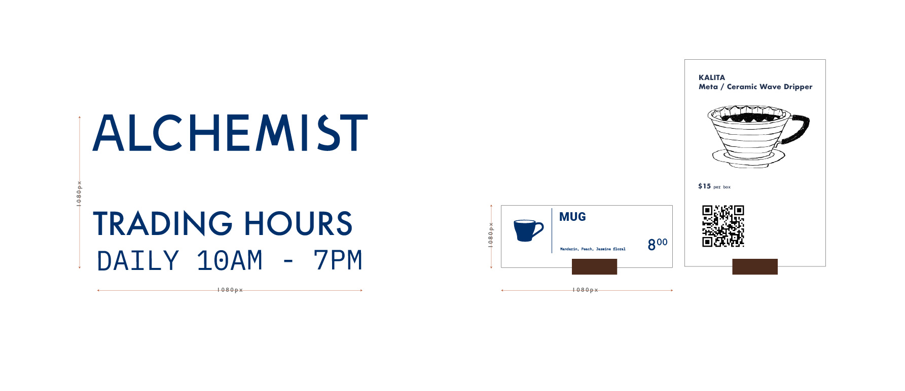
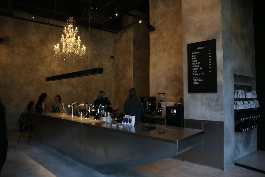
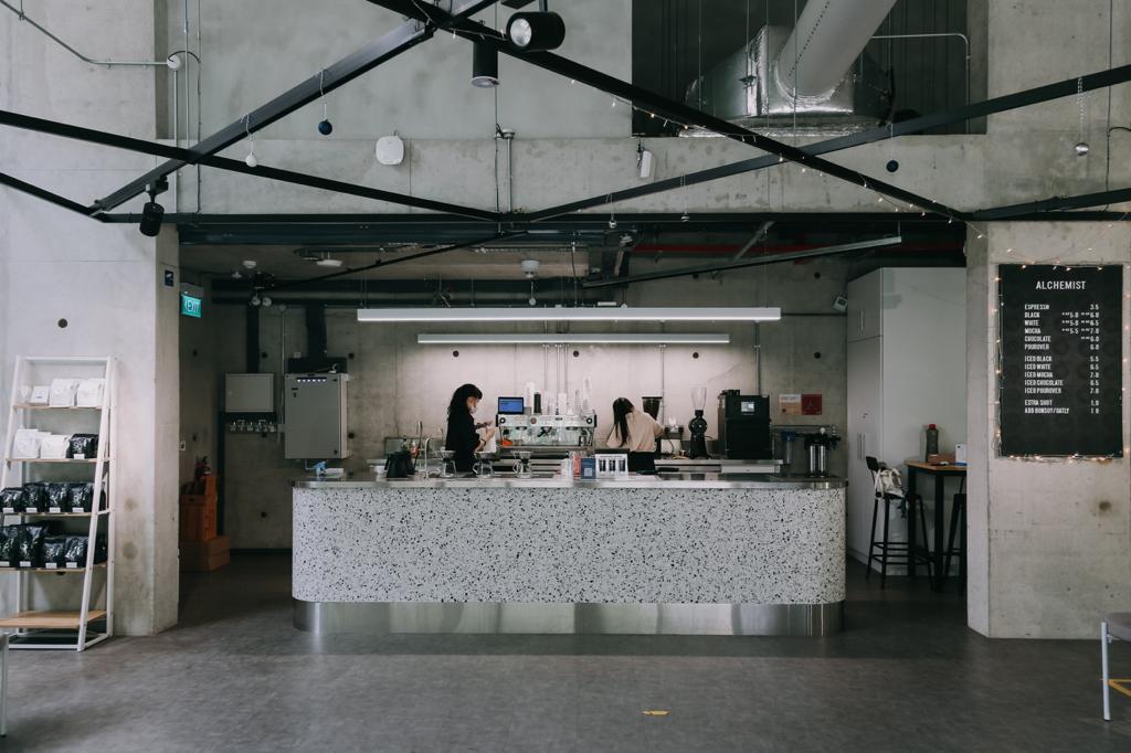
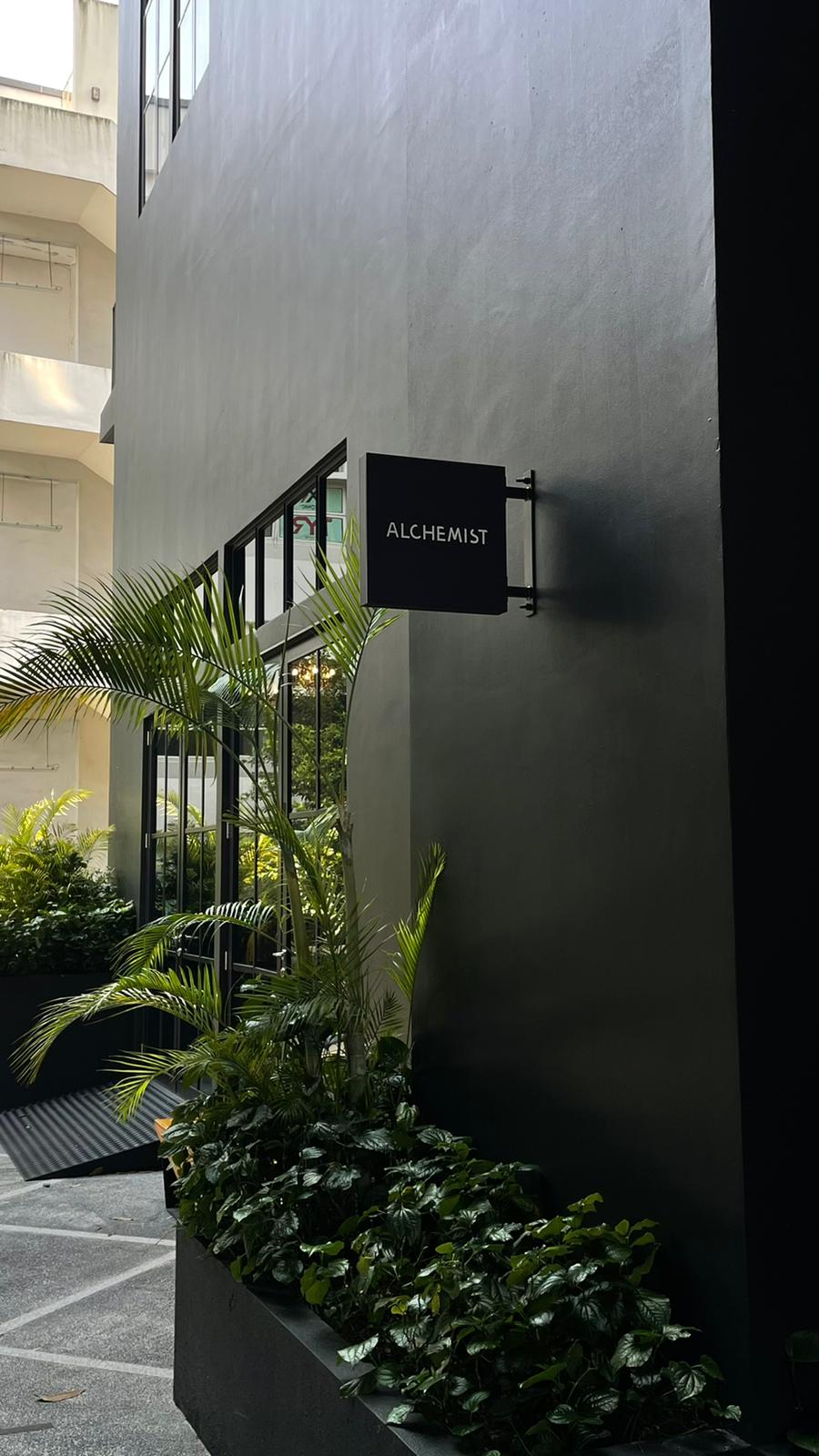
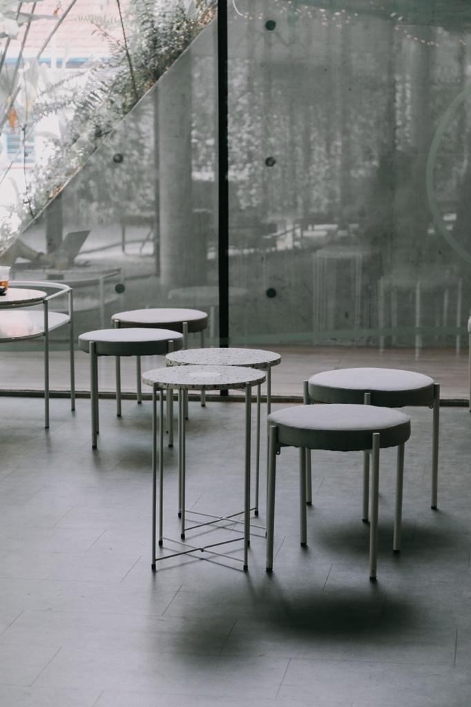
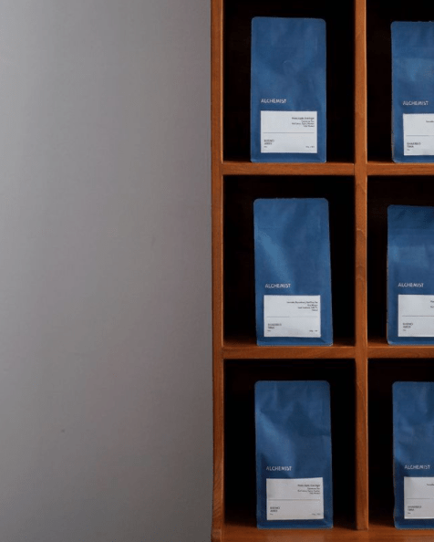
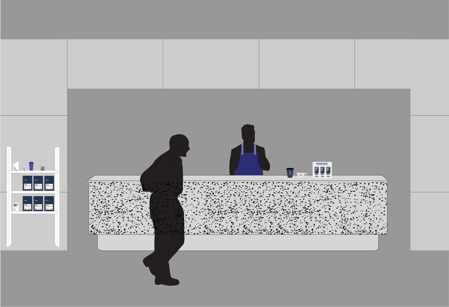
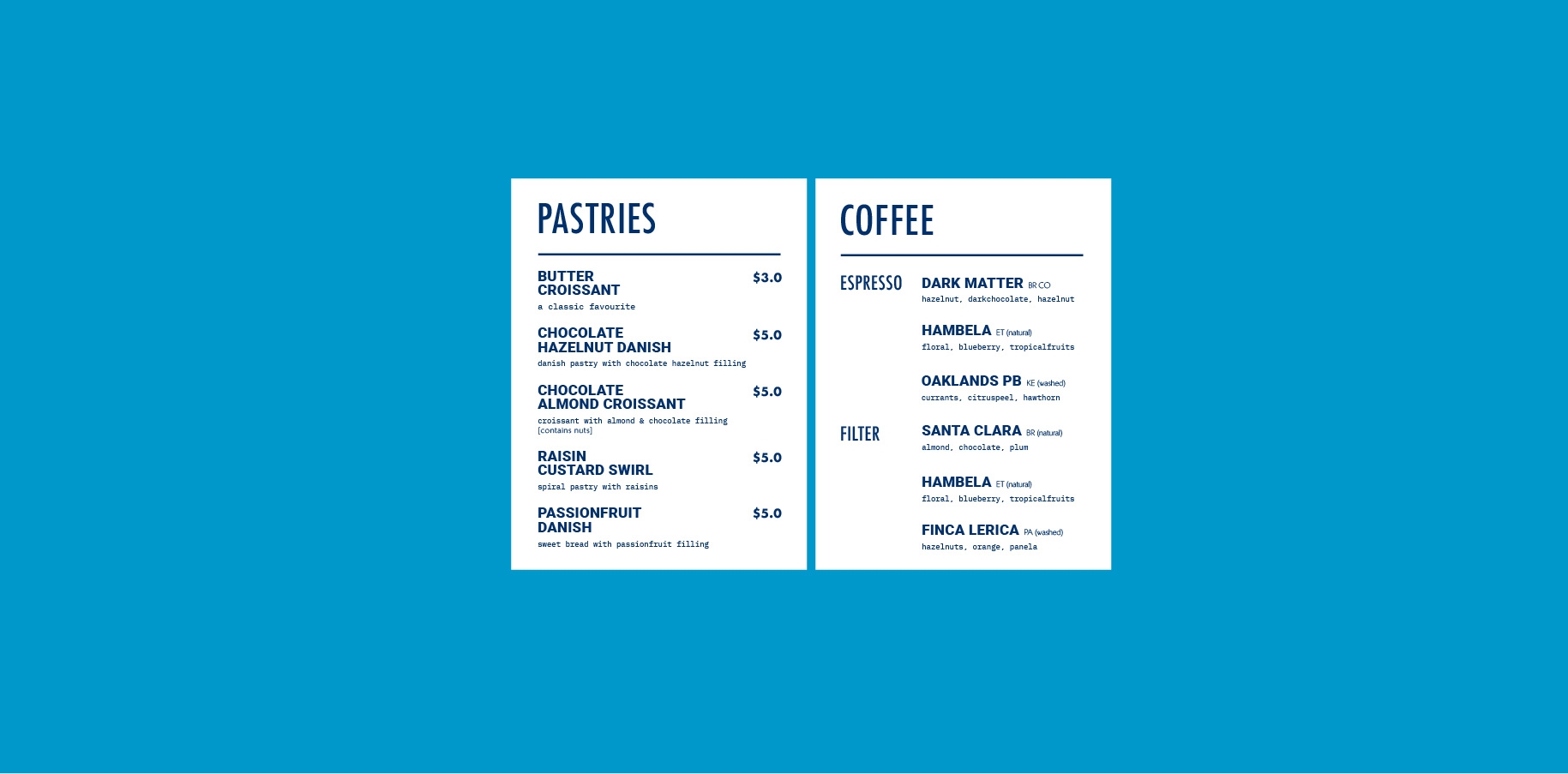
Alchemist’s visual language is consistent throughout its distinctive metal countertop in all 6 outlets of café, coffee roastery and take-away kiosk. The design cohesion has also been translated through its coffee bean bag, business stationeries and retail menus to coffee drop bag boxes.
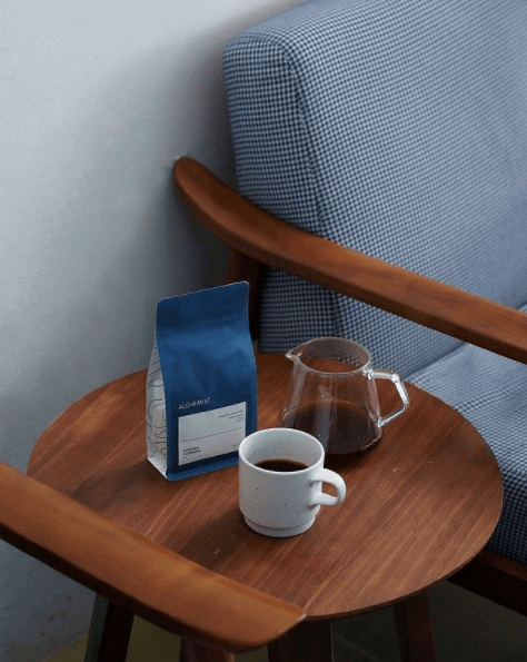
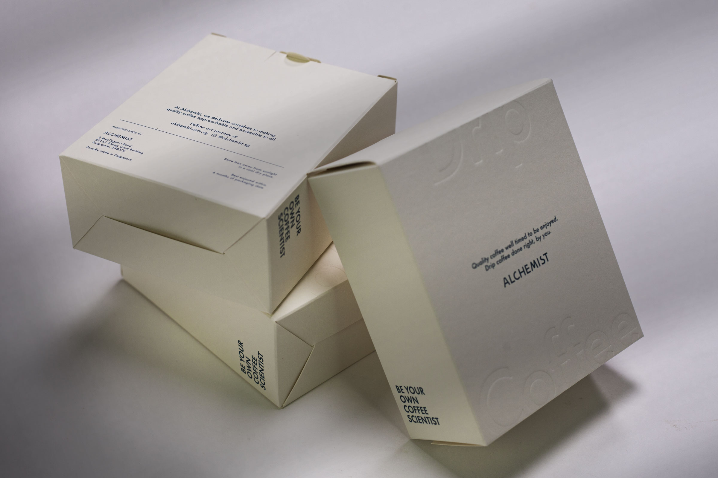
With an extra flap around its opening to keep coffee staying fresh for longer, every little detail was taken into consideration during the design process.
Because mailer bags can serve as more than just a pocket for paper, we designed them too. Alchemist’s envelopes show off the store’s signature interior of metal countertops and minimalist furnishings. Who said envelopes can’t be a marketing tool!
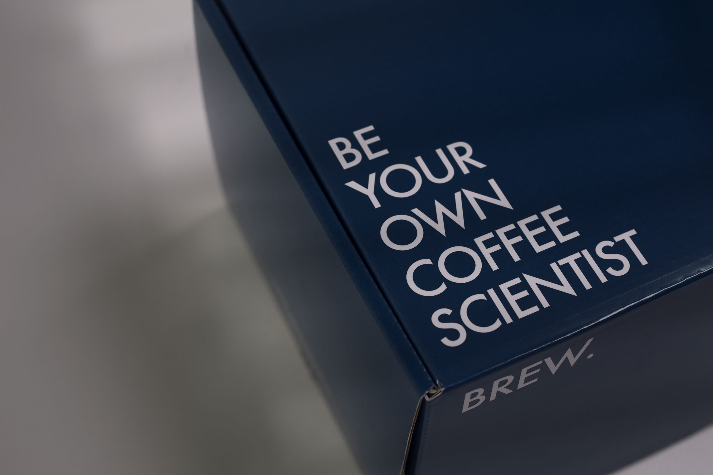
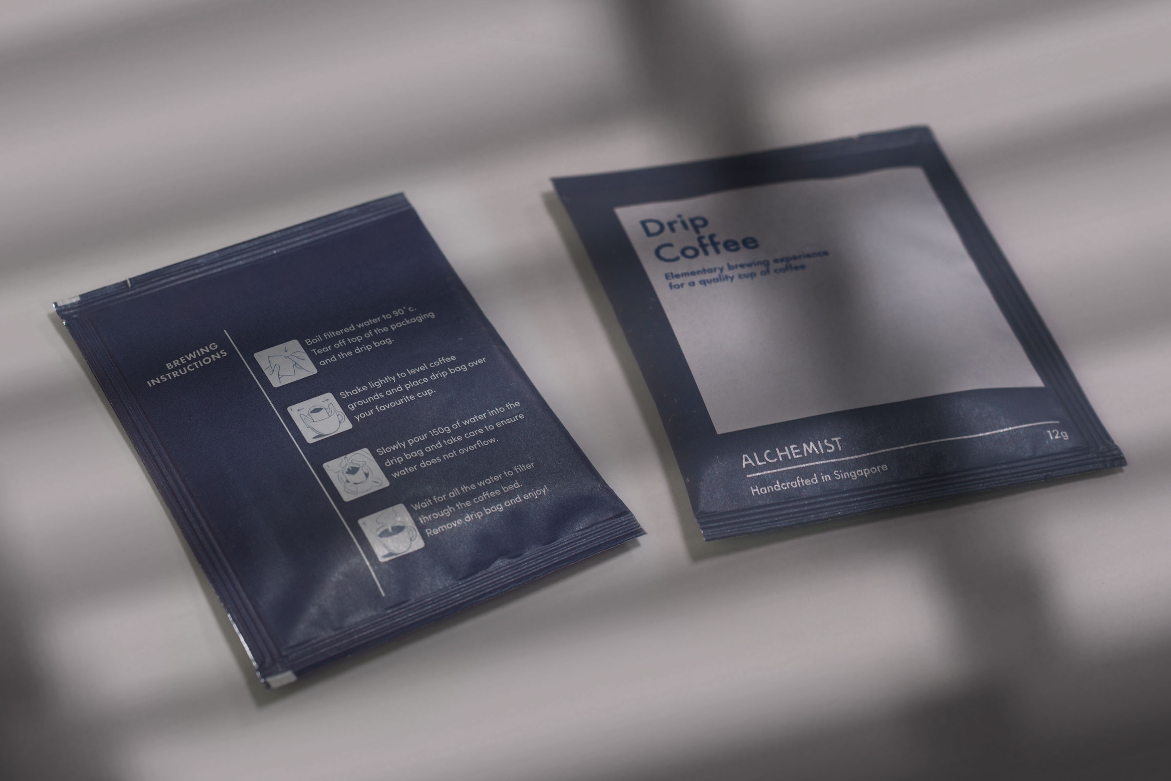

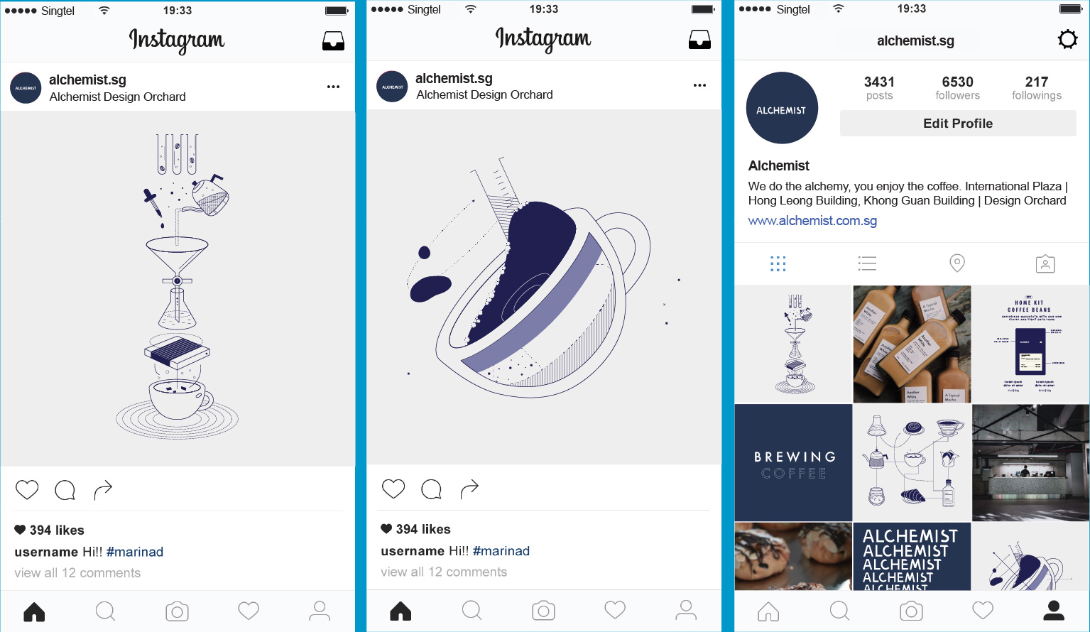
A quick search of the hashtag ‘Alchemist’ would speak for itself, revealing a substantial increase in the number of people gramming the brand. Here’s more: When Alchemist’s canned coffee first launched, over 1300 orders were placed for the coveted coffees.
Visual merchandising involves being constantly being aware of how your store and displays appear to your customers, which affects sales!
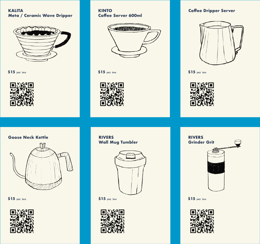
We standardised the layout of our curated shelves for the interiors of each store. Delicate items are generally placed on the top shelves while bigger, bulky items should be kept at the bottom to create a cleaner visual.
Do Not Design
Work with us — write to we@donotdesign.com
©2009—2021